Scoring genre clarity...

Randy The Racoon capsule

Randy The Racoon

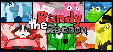
Use cartoony weapons, run over humans, take down the Goose Mafia that wants you dead, drop giant snowballs into crowds, fly your stunt car across a packed island. Do whatever you want in this Simpsons Hit & Run-inspired open world-sandbox!

$5.99Positive(10)
FunnyComedySandbox
slobbymonkJan 16, 2026

Randy The Racoon scores 68/100 — better than 17% of Funny capsules (n=3,049).

Positive (10 reviews) · $5.99 · Released Jan 16, 2026 · By slobbymonk

Quick text summary

Randy The Racoon scored 68/100 on Steam Analyzer — Solid for a Funny capsule. Top priority fix: [composition] Enlarge the raccoon protagonist in the top-left or center as a clear hero with supporting characters arranged asymmetrically around it to establish focal hierarchy.

Capsule scores by dimension

  • Genre Clarity: 7/10 — Chaotic sandbox action clear. The grid layout showcases multiple bright, colorful cartoon characters and vehicles in absurd scenarios—a raccoon, a goose, a frog, destruction, and vehicular chaos—which immediately communicate action-sandbox gameplay with comedic intent. At tiny size, the vibrant color chaos and character silhouettes still read as 'wacky action game,' though the specific sandbox and racing elements blend together. The Simpsons Hit & Run comparison would require prior knowledge to fully land.
  • Title Readability: 6/10 — Title readable but crowded layout. The white 'Randy the Raccoon' text is legible at full size with clear letterforms and outlines against the mixed background colors. However, at tiny size the title competes with six equally-sized character panels, causing the text to fight for attention rather than anchor the design. The grid layout prioritizes character showcase over title prominence, which hurts quick recognition at small thumbnail size.
  • Contrast & Color: 8/10 — Bright palette pops strongly. The capsule uses high-saturation primaries—hot pink, lime green, electric blue, yellow, and red—that create strong value separation against dark Steam background. Each character panel has distinct color blocking that reads clearly even at tiny size, and the white title outline punches through. The grayscale test confirms good light-dark separation across all elements, though the density of equally-bright colors can feel slightly chaotic at very small sizes.
  • Uniqueness & Polish: 7/10 — Distinctive cartoon charm, slight template feel. The art style is cohesively cartoonish and immediately memorable, with expressive character designs and comedic absurdism that sets it apart from generic action games. The grid mosaic layout is a deliberate and eye-catching structural choice. However, the execution feels somewhat like a character asset showcase rather than a carefully composed narrative moment—competent and fun, but not as premium-feeling as top-tier indie titles like Hades II or Sea of Stars.
  • Brand Consistency: 7/10 — Consistent cartoon style, lacks icon. All character art and UI elements share a unified bright cartoon aesthetic with consistent line weight, color saturation, and expressive design language that should feel familiar across 15 store screenshots. The raccoon protagonist is recognizable as the central brand mascot. However, there is no iconic symbol, logo mark, or signature visual motif beyond the characters themselves that would create immediate brand recall on sight alone.
  • Composition: 6/10 — Even grid dilutes focal hierarchy. The six-panel grid is geometrically balanced and visually organized, but it creates equal visual weight across all sections rather than a clear primary focal point—every character competes for attention at the same scale. The title placement in the center-left area is reasonable but doesn't anchor the composition because the grid panels around it are equally prominent. At small and tiny sizes, this becomes a pattern wash that reads as 'collage of stuff' rather than a unified, focused hero moment.

What works

  • Vibrant color palette. High-saturation primaries create strong contrast against dark Steam background and read clearly at all sizes.
  • Distinctive cartoonish art. Cohesive, expressive character design and comedic absurdism immediately signal an indie action-sandbox game with personality.
  • Legible title treatment. White outlined text is clear and readable at full size with good contrast against the background palette.

What hurts the capsule

  • Title competes with character panels. All six grid sections hold equal visual weight, so the title does not anchor or lead the eye at small/tiny sizes.
  • No focal point hierarchy. The even mosaic layout creates a pattern-wash effect rather than a clear hero moment, reducing quick recognition at thumbnail size.
  • Lacks iconic brand symbol. Character designs are memorable but there is no signature logo, mark, or visual shorthand that guarantees brand recall without text.

Priority fixes

  1. [composition] Enlarge the raccoon protagonist in the top-left or center as a clear hero with supporting characters arranged asymmetrically around it to establish focal hierarchy.
  2. [title_readability] Move the title to the top or bottom in a dedicated band with stronger isolation from character panels, ensuring it anchors the design at small size.
  3. [uniqueness_polish] Add a subtle logo symbol or signature visual element (e.g., a raccoon paw mark, goose silhouette, or racetrack motif) that reinforces brand identity beyond character art alone.

Store copy priority fixes

  1. [uniqueness] Replace the Simpsons Hit & Run comparison or add a sentence explaining what Randy does differently—e.g., 'Unlike Hit & Run's story missions, Randy lets you approach chaos through creative physics puzzles and weapon combinations' or emphasize the raccoon's personality angle as core to the experience.
  2. [feature_communication] Replace 'And much more!' with one or two concrete additional features (e.g., 'Unlock cosmetics, discover secret areas, and unlock a surprise by collecting all trash bags across the island') to maintain the specificity established earlier.
  3. [hook_strength] Expand the opening line of the detailed description ('Cartoony Physics With a bunch of cartoony weapons...') to be more character-driven or action-forward, e.g., 'Welcome to Randy's chaos-fueled island adventure' or 'Meet Randy, a raccoon with a taste for mayhem and a custom stunt car.'

Related guides

Steam app ID: 3187000 · Tags: Funny, Comedy, Sandbox, Arcade, Physics