Scoring genre clarity...
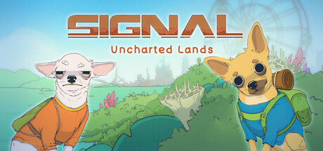
Embark on a journey with four adorable explorers! Uncover all the secrets of a post-apocalyptic world, meet the future inhabitants of Earth and enjoy plenty of Easter eggs. Your choices will shape the game's ending, so choose wisely! Or try a second playthrough to catch all the fun moments!
$4.99Very Positive(52)
DogsVisual NovelCute
HmarkaTeamMar 3, 2025