Scoring genre clarity...
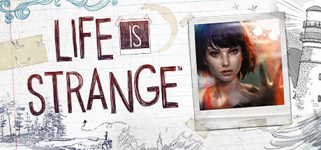
Life is Strange - Episode 1 capsule

Life is Strange - Episode 1

Episode 1 now FREE! Life is Strange is an award-winning and critically acclaimed episodic adventure game that allows the player to rewind time and affect the past, present and future.

Free to PlayOverwhelmingly Positive(1,319)
Story RichChoices MatterGreat Soundtrack
DONTNOD Entertainment, Feral Interactive (Mac), Feral Interactive (Linux)Jan 29, 2015

Life is Strange - Episode 1 scores 67/100 — better than 18% of Story Rich capsules (n=3,767).

Overwhelmingly Positive (1,319 reviews) · Free to Play · Released Jan 29, 2015 · By DONTNOD Entertainment

Quick text summary

Life is Strange - Episode 1 scored 67/100 on Steam Analyzer — Solid for a Story Rich capsule. Top priority fix: [title_readability] Increase font weight or add a subtle outline to the title letterforms to preserve legibility at small and tiny sizes without sacrificing the handwritten aesthetic.

Capsule scores by dimension

  • Genre Clarity: 7/10 — Character-driven narrative adventure clear. The female protagonist with expressive face and warm orange/red lighting suggests an emotional, story-focused game rather than action or combat. The Polaroid-style frame, handwritten elements, and intimate character portrait clearly signal a narrative adventure title at full size. At tiny size, the character silhouette and warm glow remain readable, though genre specificity (time-rewind mechanic) is not visually obvious from visual cues alone.
  • Title Readability: 5/10 — Title readable full size, struggles tiny. The title "LIFE IS STRANGE" uses a deliberate handwritten, distressed serif style with inconsistent letter weights and the trademark boxed "IS" marking. At full header size it reads clearly, but at tiny thumbnail size the decorative irregularities and thin strokes cause the letters to blur and lose individual clarity, especially the word spacing. The artistic intent competes with functional legibility at small scales.
  • Contrast & Color: 6/10 — Moderate contrast with muddy midtones. The character portrait uses warm orange/red highlights on skin tones with darker background, creating some separation against the dark Steam background. However, the overall palette sits in warm midtone territory with limited pure highlights or shadows in the central character area, reducing visual pop. The sketch elements and light background of the composition add contrast locally, but the character's face—the focal point—lacks the silhouette clarity needed for maximum impact at tiny size.
  • Uniqueness & Polish: 7/10 — Distinctive aesthetic with strong identity. The Polaroid frame, handwritten typography, sketch overlays, and intimate character study create a cohesive and recognizable visual identity distinct from action-heavy genre benchmarks. The artistic direction communicates maturity and narrative focus effectively, avoiding generic game art. The execution feels intentional and branded, though the overall composition is a fairly common portrait-plus-frame formula in indie narrative games.
  • Brand Consistency: 8/10 — Strong signature style and recognizable identity. The handwritten typography, Polaroid framing device, warm character lighting, and sketch/collage elements are consistent visual signatures across Life is Strange marketing materials. The character's short dark hair with subtle color shift, vulnerable expression, and centered portrait placement reinforce the series' intimate storytelling identity. These cues would be recognizable across multiple capsules in the franchise without needing the title text.
  • Composition: 7/10 — Clear focal point with balanced elements. The character portrait anchors the right side of the composition as the primary focal point, while the title occupies the left with supporting sketch and Polaroid frame elements. The layout hierarchy is clear: title > character face > supporting doodles. At small and tiny sizes, the portrait and title remain distinct and readable, though the distributed elements (left title, right portrait) require the full width to feel balanced and risk awkward cropping if Steam's margins shift.

What works

  • Distinctive branded typography. The handwritten, distressed serif style with the boxed 'IS' is a memorable and recognizable signature element that builds brand identity.
  • Clear character focal point. The centered protagonist portrait with warm lighting creates immediate emotional connection and communicates character-driven narrative focus.
  • Coherent art direction. Sketch overlays, Polaroid framing, and collage elements work together to establish a cohesive, premium indie aesthetic.

What hurts the capsule

  • Title legibility at tiny size. Decorative letterforms and inconsistent weights cause the title to blur and lose clarity at thumbnail scale, reducing discoverability.
  • Limited value contrast on character. The protagonist's face sits largely in warm midtones with insufficient shadow or highlight separation, reducing silhouette punch against dark Steam background.
  • Horizontal composition fragility. Title on left and portrait on right creates a wide layout vulnerable to Steam cropping margins and edge-hugging on narrower views.

Priority fixes

  1. [title_readability] Increase font weight or add a subtle outline to the title letterforms to preserve legibility at small and tiny sizes without sacrificing the handwritten aesthetic.
  2. [contrast_color] Add stronger highlight on character's face or darken surrounding midtones to create clearer silhouette separation and visual pop against the Steam dark background.
  3. [composition] Compress the layout slightly or reposition elements to ensure both title and character portrait remain fully visible and balanced within safe margins across all viewport sizes.

Store copy priority fixes

  1. [hook_strength] Move the Max Caulfield and Chloe Price story hook to the first sentence of the short description: replace the opening with 'Rewind time to save your best friend and uncover a dark mystery in Arcadia Bay.'
  2. [feature_communication] Add a brief explanation of the investigation mechanic after the rewind feature: 'Explore the town, talk to students, and gather clues to uncover what happened to Rachel Amber. Your choices and rewound moments shape who believes you.'
  3. [uniqueness] Insert a differentiator sentence after the core premise: 'Unlike branching dialogue trees, your rewind power lets you experience multiple outcomes of the same conversation, then commit to the path you choose.'
  4. [feature_communication] Reduce review quotes to 3–4 maximum and move them to a dedicated praise section below the About the Game section, not within it, to make room for gameplay details.

Related guides

Steam app ID: 319630 · Tags: Story Rich, Choices Matter, Great Soundtrack, Female Protagonist, Time Travel