Scoring genre clarity...
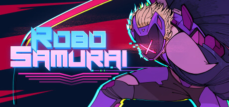
RoboSamurai is a 3rd-person fast-paced sword-fighting action/slasher game about Nix: a robot mechanic turned katana-wielding fighter. Set in a cyberpunk dystopian city filled with corruption and tyrannical corporations waiting for him to let his guard down.
$11.993 user reviews
ActionCombatHack and Slash
metapikaMar 20, 2025