Scoring genre clarity...
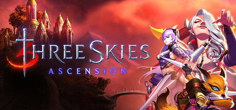
Three Skies is a turn-based, strategic RPG with challenging dungeons and hundreds of heroes and creatures to collect and customize. Explore over 100 hours of story-driven content delivered over the course of 12 chapters and more than 30 unique zones. Play now!
$14.99Mostly Positive(24)
Creature CollectorDungeon CrawlerPvP
Shiny Box GamesApr 3, 2025