Juggle Star DX scores 77/100 — better than 79% of Action capsules (n=8,534).

Quick text summary

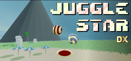
Juggle Star DX scored 77/100 on Steam Analyzer — Good for a Action capsule. Top priority fix: [uniqueness_polish] Introduce a distinctive character, mascot, or visual hook (e.g., an animated hand, face, or iconic symbol) that creates a memorable identity and signals what makes Juggle Star unique

Capsule scores by dimension

  • Genre Clarity: 8/10 — Clear casual action mechanics. The capsule immediately communicates a juggling/ball physics game through visible spheres in mid-air, directional UI arrows at ground level, and a simple low-poly environment. At tiny size, the floating balls and ground-based interaction elements remain legible enough to suggest casual action gameplay with physical precision challenges.
  • Title Readability: 9/10 — Excellent pixel font clarity. The bold retro-style pixelated title 'JUGGLE STAR' with 'DX' subtitle uses high-contrast cream/off-white lettering against the blue sky background, ensuring it remains sharp and readable even at tiny sizes. The strategic placement in the upper third and clean letterforms prevent any collapse or blur during quick scrolling on Steam's dark interface.
  • Contrast & Color: 8/10 — Strong value separation. The design uses a clean blue sky background that provides excellent contrast against the cream/yellow title text and the white/striped balls. The mid-tone green grass and darker pyramid structure create clear layering; at tiny size, the bright balls and text still pop distinctly against the overall composition without muddy mid-tones.
  • Uniqueness & Polish: 7/10 — Charming but somewhat generic. The low-poly 3D render style is clean and intentional, with a cohesive minimalist aesthetic that suits casual action games. However, the scene lacks a distinctive hook or memorable character; it feels competent and polished but relies on familiar casual game visual language rather than a unique visual selling point.
  • Brand Consistency: 6/10 — Functional but identically generic. The pixel-art title font and low-poly aesthetic are internally consistent, but there are no distinctive brand identity signals, iconic characters, or memorable motifs visible that would allow recognition across marketing materials. The simple geometric shapes and muted palette lack the visual signature needed to stand out as uniquely 'Juggle Star' rather than any other casual physics game.
  • Composition: 8/10 — Balanced hierarchy with clear focus. The three floating balls form a natural focal point in the center-upper portion, with the directional arrows and ground elements supporting without competing for attention. The pyramid structure anchors the background left, and the title sits safely in the upper third with proper margins; the layout remains clear and uncluttered at all viewing sizes, with no critical elements at risk of Steam's typical edge cropping.

What works

  • Readable retro title design. Pixelated cream-colored lettering with high contrast against the blue sky ensures the game name remains legible and distinctive even when scrolled past at thumbnail size.
  • Clear gameplay communication. The floating striped balls, ground arrows, and simple environment immediately signal a physics-based casual action game about juggling and precision.
  • Clean composition hierarchy. The centered ball cluster draws the eye naturally, with supporting elements (arrows, pyramid) positioned to enhance rather than clutter the layout.
  • Cohesive low-poly aesthetic. The 3D render style is intentional and consistent throughout, creating a unified and polished visual presentation.

What hurts the capsule

  • Generic visual identity. The scene lacks a distinctive character, mascot, or signature visual motif that would make this capsule recognizable as uniquely 'Juggle Star' rather than a template casual game.
  • Minimal brand differentiation. Compared to top-performing casual titles like Balatro or Sticky Business, this capsule doesn't communicate a distinctive core mechanic or memorable visual hook beyond basic ball physics.
  • Understated DX branding. The small 'DX' subtitle is secondary in visual weight and does not establish a premium or updated edition identity that would justify rebranding.

Priority fixes

  1. [uniqueness_polish] Introduce a distinctive character, mascot, or visual hook (e.g., an animated hand, face, or iconic symbol) that creates a memorable identity and signals what makes Juggle Star unique
  2. [brand_consistency] Establish a recognizable signature element or palette (e.g., a recurring character design, iconic color accent, or UI motif) that can carry across all marketing materials for consistent brand recall
  3. [genre_clarity] Consider adding a subtle visual cue that emphasizes the 'physics puzzle' or 'precision challenge' angle (e.g., a target, constraint UI, or difficulty indicator) to further clarify the game's appeal at tiny size

Store copy priority fixes

  1. [hook_strength] Rewrite the opening line to lead with a sensory or emotional hook: 'Spin, catch, and combo your way through hand-crafted arcade levels' instead of the instructional 'you are to keep balls in the air.'
  2. [feature_communication] Clarify the 'high rotation audio mechanics' feature—explain in 1–2 sentences how it affects gameplay or immersion so it feels substantive rather than decorative.
  3. [uniqueness] Add 1–2 sentences that articulate what makes Juggle Star DX distinct, such as a specific mechanic, visual style, or gameplay philosophy that differentiates it from other arcade juggling games.
  4. [audience_targeting] Specify which player archetype benefits most from this game (e.g., 'perfect for arcade enthusiasts seeking quick, skill-based challenges' or 'ideal for relaxed play sessions') to strengthen audience clarity.

Related guides

Steam app ID: 3204380 · Tags: Action, Casual, Arcade, Singleplayer, 2.5D