Scoring genre clarity...
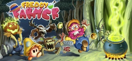
Freddy's daughter has been kidnapped by an evil dragon. To rescue her, he must cross the entire kingdom taking some ingredients with which to make a magic potion, but it won't be easy, they must be collected in a specific order and Freddy will have to overcome the dangers he finds in his path.
$4.99Positive(35)
ArcadeRetro2D Platformer
Catcade GamesMar 4, 2025