Scoring genre clarity...

Canvas - The Board Game capsule

Canvas - The Board Game

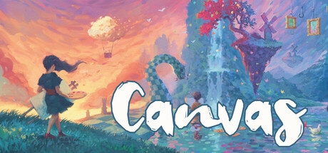
Create stunning paintings, layer cards strategically, and score ribbons in Canvas - a digital board game where art meets strategy. Choose and combine Art Cards to create beautiful paintings and enjoy a mix of artistic expression and tactical gameplay.

$14.99Positive(18)
Board GameStrategyTurn-Based Tactics
Mipmap DigitalOct 27, 2025

Canvas - The Board Game scores 77/100 — better than 75% of Board Game capsules (n=631).

Positive (18 reviews) · $14.99 · Released Oct 27, 2025 · By Mipmap Digital

Quick text summary

Canvas - The Board Game scored 77/100 on Steam Analyzer — Good for a Board Game capsule. Top priority fix: [genre_clarity] Consider adding subtle visual cues such as a card corner, board grid, or ribbon icon in the background to reinforce the board game strategy identity without compromising the artistic aesthetic.

Capsule scores by dimension

  • Genre Clarity: 7/10 — Artistic indie game with strategy hints. The warm sunset palette, painterly art style, and whimsical character silhouette on the left clearly signal a creative, indie game with artistic themes. The fantasy architecture and magical atmosphere suggest adventure or puzzle gameplay, though at TINY size the strategy board game aspect is not immediately obvious—the visuals lean more toward art adventure than card/board mechanics. Genre clarity works well at SMALL size but loses tactical specificity at TINY.
  • Title Readability: 8/10 — Clear, well-positioned white title. The 'Canvas' title uses bold white serif lettering with a soft shadow outline that provides strong contrast against the colorful background. The title sits in the lower-middle region with breathing room and remains legible at SMALL and TINY sizes without collapsing. At TINY size the word 'Canvas' is readable with no letter loss, though fine serif details compress slightly.
  • Contrast & Color: 8/10 — Warm-cool separation with strong pop. The warm golden-orange sunset gradient in the left half contrasts sharply against the cool blue-purple right half, creating excellent value separation and silhouette clarity on the dark Steam background. The white title text pops distinctly, and the character and architecture silhouettes remain clearly defined even in grayscale. This strong warm-cool push and high saturation make the capsule stand out in scroll without muddy mid-tones.
  • Uniqueness & Polish: 8/10 — Premium illustrative art, cohesive vision. The capsule features hand-painted illustrative quality with atmospheric lighting, layered depth, and a distinctive color palette that feels elevated and intentional rather than templated. The composition tells a visual story—a character ascending toward a magical floating structure—that hints at creative gameplay and artistic themes. Compared to typical casual game capsules, this feels premium and memorable, with no cheap asset vibe or generic treatment.
  • Brand Consistency: 7/10 — Cohesive art style, recognizable palette. The warm-cool contrast palette, painterly illustration technique, and whimsical magical setting create a consistent internal visual language that would be recognizable across marketing materials. The character archetype (young figure in silhouette) and floating castle aesthetic suggest a memorable brand identity. However, without visibility of other official Canvas assets, it is not possible to confirm whether this palette and style consistently appear in store screenshots or other brand touchpoints.
  • Composition: 8/10 — Strong focal point, balanced depth layers. The character on the left serves as the primary focal point, with the floating structure and sunset on the right creating secondary visual interest and forward momentum. Foreground, midground (character and floating elements), and background (sunset gradient) are clearly layered, creating depth and hierarchy. The title sits naturally in the lower zone without competing for attention, and the composition remains readable and balanced at SMALL and TINY sizes without edge clipping issues.

What works

  • Outstanding color contrast. Warm golden-orange versus cool blue-purple creates immediate visual separation and strong pop against Steam's dark background, ensuring discoverability in quick scroll.
  • Premium illustrative quality. Hand-painted art style with atmospheric lighting and intentional color grading elevates the visual polish and distinguishes it from generic casual game templates.
  • Clear title legibility. White serif letterforms with soft shadow sit in an optimal placement with strong contrast, remaining readable across full, small, and tiny sizes without decoration loss.
  • Strong depth composition. Clear foreground-midground-background layering guides the eye naturally and creates visual storytelling that hints at creative gameplay mechanics.

What hurts the capsule

  • Board game mechanics not evident. At TINY size, the capsule reads as an art adventure or fantasy game rather than a strategy board game; card or turn-based UI cues are absent from the visual messaging.
  • Casual strategy subgenre unclear. The whimsical, painterly aesthetic doesn't strongly signal the 'board game' aspect that differentiates Canvas from typical indie adventure titles, potentially affecting discoverability for strategy game audiences.

Priority fixes

  1. [genre_clarity] Consider adding subtle visual cues such as a card corner, board grid, or ribbon icon in the background to reinforce the board game strategy identity without compromising the artistic aesthetic.
  2. [composition] Verify that the floating castle and background details remain readable at thumbnail size across Steam's various display contexts to ensure no loss of visual storytelling.

Store copy priority fixes

  1. [feature_communication] Expand the ribbon/scoring explanation with one sentence: 'Ribbons are earned by completing specific scoring conditions with your layered Art Cards—for example, revealing all of one icon type or matching a target painting pattern—and contribute to your total score.' This clarifies the primary win condition.
  2. [uniqueness] Add a 2-3 sentence paragraph after the opening detailing what digital features or design choices enhance this version beyond the physical board game, such as 'Digital layering reveals instantly,' 'No component shuffling or setup,' or 'Cloud-synced galleries let you collect and share your best creations.'
  3. [hook_strength] Replace 'Create stunning paintings' with a more specific verb: 'Layer transparent Art Cards to build unique paintings and compete for ribbons in Canvas—where tactical card choices shape both your masterpiece and your score.' This moves from marketing adjective to concrete gameplay.
  4. [audience_targeting] Add a single sentence early in the detailed description signaling the primary experience: 'Whether you're playing solo against AI, competing in local split-screen, or facing opponents online, every painting tells a story and every card choice matters.' This makes audience choice explicit.

Related guides

Steam app ID: 3209240 · Tags: Board Game, Strategy, Turn-Based Tactics, Puzzle, PvP