Scoring genre clarity...

Putt in Parks capsule

Putt in Parks

Step onto the lush & relaxing world of Putt in Parks, the most chill minigolf experience set in stunning, stylized landscapes. Embrace the delightfully melancholy & explore Putt in Parks' relaxing yet challenging courses.

$7.99Positive(13)
ExplorationSportsMini Golf
tinyaxeMar 23, 2026

Putt in Parks scores 85/100 — better than 99% of Exploration capsules (n=4,872).

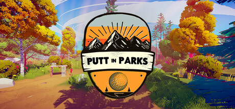
Positive (13 reviews) · $7.99 · Released Mar 23, 2026 · By tinyaxe

Quick text summary

Putt in Parks scored 85/100 on Steam Analyzer — Excellent for a Exploration capsule. Top priority fix: [uniqueness_polish] Emphasize the 'melancholy' or 'chill' emotional hook with a subtle design signal (e.g., weather effect, moodier lighting, or character presence) to differentiate from standard outdoor minigolf games

Capsule scores by dimension

  • Genre Clarity: 9/10 — Golf sport gameplay instantly clear. The centered golf ball with sunburst backdrop, mountain silhouette, and 'PUTT in PARKS' text immediately signal minigolf/golf sport gameplay. The stylized natural landscape with autumn trees and scenic vista reinforces the casual outdoor recreation theme. At TINY size, the golf ball icon and mountain logo remain unmistakably readable and genre-specific.
  • Title Readability: 9/10 — Bold logo dominates with clarity. The 'PUTT in PARKS' title sits in a clean white badge with strong black outline and orange fill, positioned centrally below the golf ball for maximum prominence. The letterforms are thick, sans-serif, and maintain perfect legibility at all sizes from full header down to tiny thumbnail. At SMALL and TINY sizes, the logo remains the focal point with zero degradation.
  • Contrast & Color: 8/10 — Warm palette pops well overall. The orange and yellow color scheme contrasts effectively against the deep blue sky and green foliage, with the white badge providing strong separation from surrounding elements. The golf ball's orange sunburst reads cleanly even in grayscale due to value separation from background. At TINY size, the orange-to-blue contrast sustains readability, though some mid-tone tree details lose definition.
  • Uniqueness & Polish: 8/10 — Stylized art direction feels premium. The capsule features distinctive low-poly or painterly landscape rendering with a cohesive warm autumn aesthetic that differentiates it from generic sports game templates. The badge design integrates the golf ball as a functional compositional anchor rather than a floating element. The overall craft feels intentional and distinctive, though the concept of 'golf in nature' is familiar across indie titles.
  • Brand Consistency: 8/10 — Strong visual identity reinforced. The badge logo with mountain, sunburst, and golf ball creates a memorable, iconic motif that could be recognized across store assets and marketing. The warm orange-gold palette appears consistent with the in-game environment shown in background, suggesting cohesive art direction. The natural landscape setting and autumn color treatment establish a recognizable brand signature for relaxed outdoor gameplay.
  • Composition: 9/10 — Centered hierarchy with depth layers. The composition uses clear depth: foreground golf ball in badge, midground autumn trees and park paths, background mountain and sky, creating strong layering that reads at all sizes. The centered logo balances the scenic backdrop without feeling cramped, and safe margins protect text from Steam cropping. The focal point (badge) remains dominant even at TINY size with no visual competition from scattered elements.

What works

  • Genre-specific iconography instantly recognizable. The golf ball with sunburst and mountain silhouette are immediately understood as minigolf sport without ambiguity.
  • Logo design is distinctive and memorable. The white badge with clean serif-free lettering and integrated golf ball icon feels premium and branded.
  • Excellent scaling resilience across sizes. All key elements maintain clarity from full header through tiny thumbnail with zero legibility collapse.
  • Cohesive warm color palette supports theme. The autumn orange, yellow, and green tones reinforce relaxing outdoor recreation and differentiate from generic sports UI.

What hurts the capsule

  • Limited narrative differentiation from similar titles. While well-executed, the 'golf in scenic nature' concept is explored by multiple indie games, reducing unique hook clarity.
  • Background detail density increases blur vulnerability. The busy autumn tree foliage and path elements in the midground lose definition at TINY size during quick scroll, though core badge remains strong.

Priority fixes

  1. [uniqueness_polish] Emphasize the 'melancholy' or 'chill' emotional hook with a subtle design signal (e.g., weather effect, moodier lighting, or character presence) to differentiate from standard outdoor minigolf games
  2. [composition] Slightly simplify or blur the background tree density to ensure midground does not compete with the badge focal point at TINY sizes during active scroll

Store copy priority fixes

  1. [hook_strength] Rewrite the opening line to lead with the core action: 'Sink putts through sun-dappled forests, lakeside greens, and twilight mountains in Putt in Parks—a minigolf game built for peace, not pressure.' This leads with gameplay while preserving mood.
  2. [feature_communication] Add 1–2 sentences explaining the putting mechanic and how difficulty progresses (e.g., 'Master intuitive swing controls as you navigate increasingly creative course designs, from flat greens to slopes and obstacles').
  3. [uniqueness] Specify what makes each course architecturally or narratively distinct beyond atmosphere, or add a line about dynamic course design (e.g., 'Each park tells its own story through environmental details and hidden paths').

Related guides

Steam app ID: 3212050 · Tags: Exploration, Sports, Mini Golf, Golf, Immersive Sim