Bratz® Rhythm & Style scores 77/100 — better than 66% of Family Friendly capsules (n=2,895).

Quick text summary

Bratz® Rhythm & Style scored 77/100 on Steam Analyzer — Good for a Family Friendly capsule. Top priority fix: [title_readability] Increase size or weight of 'Rhythm & Style' tagline to maintain readability at TINY size, or relocate to a less dense background region.

Capsule scores by dimension

  • Genre Clarity: 7/10 — Fashion game with rhythm elements. The capsule clearly communicates a fashion-focused casual game through the four stylized female characters in colorful outfits positioned center stage, and the neon stage setup with circular frames suggests performance and music gameplay. At TINY size, the character silhouettes and bright costumes remain readable, though the rhythm aspect is less obvious than the fashion focus; the overall aesthetic reads as a style-driven casual title rather than ambiguously mixed genres.
  • Title Readability: 8/10 — Bold logo with strong contrast. The 'BRATZ' title in large hot pink with a clean outline sits prominently in the upper left against the dark background, with 'Rhythm & Style' as secondary text below in purple. The main logo remains readable even at SMALL size due to its size and saturation; at TINY size the primary 'BRATZ' wordmark holds legibility, though the tagline becomes harder to parse. The strategic placement on the left avoids overlap with the busy character cluster.
  • Contrast & Color: 8/10 — Vibrant neon palette pops clearly. Hot pink, purple, and cyan elements create strong value separation against the near-black background, with the neon stage lighting and character outfits providing excellent silhouette clarity. Even when squinting, the magenta-to-cyan gradient circle and character shapes remain distinct. The warm flesh tones of the character faces and cool neon accents create depth; grayscale conversion would show clean mid-to-bright value separation maintaining visual hierarchy.
  • Uniqueness & Polish: 7/10 — Polished brand-aligned execution. The capsule demonstrates clean craft with the four distinct Bratz character archetypes posed confidently on a stage, aligned with the established Bratz visual identity and current cartoon art style. The neon stage and lighting effects feel intentional and cohesive rather than random; however, the composition is relatively conventional for the Bratz franchise and does not introduce a visually novel hook beyond what fans expect. The execution is premium and on-brand without pushing distinctiveness beyond the core IP aesthetic.
  • Brand Consistency: 8/10 — Strong Bratz identity recognition. The four character lineup with distinct fashion archetypes, color-coded outfits (black, red, blue, brown), and expressive stylized faces directly echo iconic Bratz brand imagery and toy line recognition. The hot pink and purple palette with neon effects are signature Bratz visual cues; the stage setting reinforces the performance and glamour themes central to brand positioning. Internal cohesion is strong: art style, proportions, lighting, and effects all align with Bratz IP expectations.
  • Composition: 8/10 — Well-balanced stage focal point. The four characters form a clear triangular focal point in the center-lower half of the image, with the neon stage frame and circular lighting elements drawing the eye inward rather than to edges. The title placement on the left provides balance without competing for attention; the supporting stage architecture and background neon create visual depth without clutter. At SMALL and TINY sizes, the character cluster remains the primary read, and key elements avoid extreme edge cropping, maintaining legibility across viewing conditions.

What works

  • Strong contrast against dark Steam background. Hot pink, purple, and cyan neon elements pop vibrantly against #1b2838, ensuring quick visual recognition during fast scrolling.
  • Recognizable character lineup and brand identity. The four distinct Bratz archetypes with signature fashion styles and color coding are immediately identifiable to the target audience and reinforce brand consistency.
  • Clear visual hierarchy and focal point. Character poses and stage lighting guide the eye to the center without scattered competing elements, maintaining readability at all sizes.
  • Legible primary logo placement. The 'BRATZ' wordmark is large, saturated, and positioned on a controlled background region, remaining readable at SMALL and TINY sizes.

What hurts the capsule

  • Tagline loses clarity at tiny size. 'Rhythm & Style' secondary text becomes difficult to parse at TINY viewing size despite adequate contrast, reducing immediate genre clarity.
  • Limited gameplay mechanic visibility. The capsule emphasizes fashion and characters but provides minimal visual cues about rhythm mechanics, music gameplay, or battle systems beyond stage setting.
  • Generic stage composition approach. The neon stage setup, while on-brand, follows a conventional performance-game visual formula that does not visually distinguish this title's unique selling points.

Priority fixes

  1. [title_readability] Increase size or weight of 'Rhythm & Style' tagline to maintain readability at TINY size, or relocate to a less dense background region.
  2. [genre_clarity] Add subtle visual rhythm or music cues—such as note symbols, sound waves, or stage-based gameplay UI hints—to better communicate the rhythm mechanic alongside fashion focus.
  3. [uniqueness_polish] Introduce a visual element or effect that highlights a core mechanic (e.g., outfit customization preview, battle stance, or song visualization) to differentiate from generic performance games.

Store copy priority fixes

  1. [feature_communication] Expand the DESIGN NEW STYLES bullet to explain what players do with custom outfits—e.g., 'DESIGN NEW STYLES – Create and compete in your custom looks on the runway and in dance-offs to unlock new cities and items.'
  2. [uniqueness] Add a sentence to the short description that articulates a specific mechanic or moment unique to Bratz—e.g., 'Unlock signature Bratz collection pieces' or 'Master the Bratz dance moves' to differentiate from generic rhythm games.
  3. [feature_communication] Add a brief sentence explaining win conditions or progression—e.g., 'Outshine rivals in fashion and dance challenges to unlock new cities and compete against tougher opponents' to clarify the gameplay loop.
  4. [hook_strength] Consider adding a second sentence hook for non-Bratz fans, such as a gameplay benefit—e.g., '
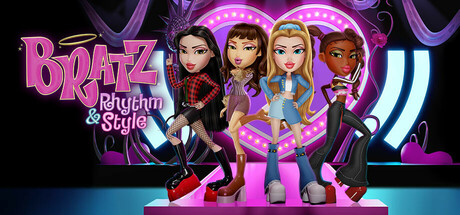
Rule the runway and take the stage with the Bratz Pack! Mix rhythm, fashion design, and multiplayer party chaos to become the ultimate style icon.'

Related guides

Steam app ID: 3212580 · Tags: Family Friendly, Character Customization, Female Protagonist, Cute, Rhythm