Scoring genre clarity...
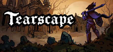
As a hunter, you explore a dark, interconnected world filled with dungeons, relying on precise combat to survive. Battle grotesque monsters, expand your arsenal, and uncover hidden paths in a non-linear, pixel art journey.
$14.99Very Positive(17)
Souls-like2DExploration
NERDS TAKE OVERFeb 2, 2026