Scoring genre clarity...
Planet Zoo 2 capsule

Planet Zoo 2

Build a wilder world in Planet Zoo 2. Create distinctive zoos around the globe filled with awe-inspiring animals, including fully aquatic and flying species, before taking your experience beyond the zoo to release your animals into expansive Wildlife Reserves.

$49.99Mixed(2,552)
SimulationStrategyCasual
Frontier DevelopmentsOct 13, 2026

Planet Zoo 2 scores 87/100 — better than 97% of Simulation capsules (n=6,475).

Mixed (2,552 reviews) · $49.99 · Released Oct 13, 2026 · By Frontier Developments

Quick text summary

Planet Zoo 2 scored 87/100 on Steam Analyzer — Excellent for a Simulation capsule. Top priority fix: [contrast_color] Ensure tiger coat saturation remains distinct at 120px width by testing on actual Steam dark background to confirm pop.

Capsule scores by dimension

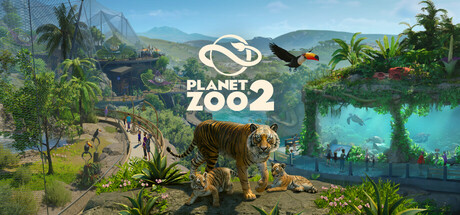
  • Genre Clarity: 9/10 — Zoo management sim crystal clear. The capsule immediately communicates management simulation through multiple visual cues: a large tiger in the foreground, lush zoo habitat with visitors, landscaping elements, and aerial view perspective. At tiny size, the distinctive tiger silhouette and layered landscape still read as a construction/management game with animals as the core focus. Genre is unmistakable and specific to wildlife management.
  • Title Readability: 9/10 — Bold logo centered and legible. The 'PLANET ZOO 2' logo is large, white, centrally positioned with strong contrast against the mid-tone sky and landscape. The logotype remains fully readable at small and tiny sizes due to its bold weight, clear letterforms, and clean outline treatment. No decorative font decay at reduced sizes; the numeral '2' adds recognition cue.
  • Contrast & Color: 9/10 — Vibrant palette pops against dark. Warm golden-brown tiger, bright turquoise water, lush green foliage, and bright sky create strong value separation against the dark Steam background #1b2838. The tiger's warm coat reads distinctly even at tiny size, and the blue water provides clear silhouette separation. No muddy midtones; saturation is controlled but vibrant enough to pop on quick scroll.
  • Uniqueness & Polish: 8/10 — Premium polish with distinctive subject. The capsule shows high-quality 3D rendering with attention to environmental detail, lighting, and composition that feels premium rather than templated. The featured tiger as a photographic centerpiece creates a distinctive visual hook compared to generic zoo capsules. At small sizes, the crafted scene still reads as intentional and polished, not asset-generic.
  • Brand Consistency: 8/10 — Consistent simulation aesthetic identity. The visual language aligns with the Planet Zoo franchise's signature aesthetic: realistic animal rendering, vibrant natural environments, player-buildable landscape, and clear management UI hints (visible paths, visitor populations). The warm earth-tone and nature-first color palette creates recognizable identity. The scene composition feels proprietary to the franchise rather than generic.
  • Composition: 9/10 — Layered focal point with hierarchy. The tiger occupies a strong mid-ground focal point with clear depth layering: background mountains, midground habitat with visitors and water features, and foreground vegetation framing. The logo sits confidently in the upper-center safe zone without competing for attention. Safe margins are respected, and no critical elements are edge-hugging. The composition remains readable at all three stress-test sizes.

What works

  • Tiger centerpiece commands attention. The large, realistically rendered tiger serves as an immediate focal point that communicates the wildlife management core mechanic and creates emotional engagement.
  • Environmental richness tells the story. Layered landscape with water, vegetation, paths, and distant mountains conveys the game's scope and management depth without feeling cluttered.
  • Color and contrast excel at small sizes. Warm orange-browns, cool turquoise, and greens maintain visual separation even at tiny resolution, ensuring the design doesn't collapse under Steam's browsing conditions.
  • Logo design is timeless and readable. The white 'PLANET ZOO 2' typography is bold, centered, and holds legibility across all viewing scales without relying on fine details.

What hurts the capsule

  • Sky occupies large mid-tone area. The upper half contains significant light blue sky that, while not problematic, is less engaging than the habitat detail below and risks feeling empty at very small sizes.
  • Visitor figures lack individual clarity. The small human figures in the mid-ground are difficult to distinguish individually at tiny sizes, reducing the sense of 'living zoo' impact at reduced resolution.

Priority fixes

  1. [contrast_color] Ensure tiger coat saturation remains distinct at 120px width by testing on actual Steam dark background to confirm pop.

Store copy priority fixes

  1. [hook_strength] Rewrite the opening line to lead with the most distinctive innovation: 'Build a global zoo empire with fully aquatic and flying species for the first time, then release animals into living Wildlife Reserves' instead of the abstract 'wilder world.'
  2. [feature_communication] Add one sentence to the guest/amenity section that clarifies the strategic loop: 'Satisfy guest needs to increase zoo ratings and revenue, unlocking new species and expansion opportunities' so the connection to progression is explicit.
  3. [uniqueness] Insert a comparative statement after the aquatic section: 'Expand beyond the first game's landbound roster with the debut of fully aquatic species and aviaries that challenge your habitat design in new ways,' to cement what this sequel adds versus the original.
  4. [audience_targeting] Add explicit difficulty or complexity signals early in the detailed description, such as 'whether you want a relaxing creative sandbox or a challenging management sim with deep economic systems' to help players self-select and manage expectations.

Related guides

Steam app ID: 3219030 · Tags: Simulation, Strategy, Casual, Sandbox, City Builder