Scoring genre clarity...
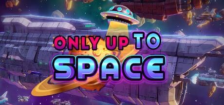
Only Up To Space is a casual yet heart-pounding climbing and platforming adventure that will test your skill, patience, and determination. As a stranded astronaut, you must ascend through a series of challenging, ever-ascending platforms to reach to the top after losing your shuttle. No wrong steps.
$6.991 user reviews
AdventureCasualSimulation
Mascot Bro Studio, PixelHixel GamesJul 11, 2025