Scoring genre clarity...
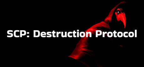
In SCP: Destruction Protocol, you are a rebel aiming to destroy an underground complex and end horrific experiments. After your team perishes, you’re left alone to navigate three dangerous zones, evade nearly invulnerable SCPs, and activate the Destruction Protocol.
$5.99Mixed(15)
CasualActionFirst-Person
Kage ProtocolNov 26, 2025