Super Star Battle scores 77/100 — better than 75% of Casual capsules (n=10,153).

Quick text summary

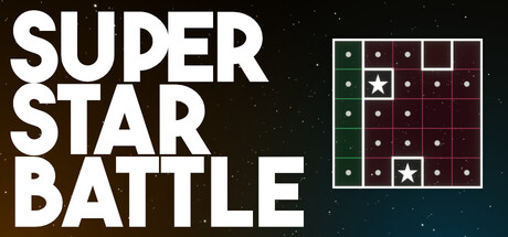
Super Star Battle scored 77/100 on Steam Analyzer — Good for a Casual capsule. Top priority fix: [brand_consistency] Add a memorable visual motif or character that represents the game's personality and can serve as a recognizable brand symbol across marketing.

Capsule scores by dimension

  • Genre Clarity: 8/10 — Puzzle game instantly recognizable. The grid-based puzzle mechanic with stars and constraint rules is immediately visible and clearly communicates a logic puzzle game. The 5x5 grid with stars and empty cells reads as sudoku-like mechanics even at tiny size. At TINY size, the grid structure remains the dominant visual cue, successfully signaling the puzzle genre.
  • Title Readability: 9/10 — Bold, clear, high contrast text. The white sans-serif 'SUPER STAR BATTLE' title uses excellent contrast against the dark background with thick letterforms and generous letter spacing. The text remains fully legible at SMALL and TINY sizes due to bold weight and clean geometry. No decorative font issues or collapse at reduction.
  • Contrast & Color: 8/10 — Strong separation with warm accents. White title text and white stars pop strongly against the dark teal-to-black gradient background, with warm golden-yellow stars providing additional color separation. The grid's dark burgundy and green cells read clearly against the background and create visual interest without muddiness. Grayscale test confirms strong value separation between title, grid, and background.
  • Uniqueness & Polish: 7/10 — Competent puzzle presentation with charm. The design effectively communicates the core mechanic through the visible grid state, and the star placement theme is distinctive for this subgenre. The overall execution is clean and intentional, though the visual treatment relies heavily on the puzzle mechanic itself rather than a unique art style or premium narrative hook. Compared to top-tier indie capsules, it reads as solid and functional without a standout visual or thematic twist.
  • Brand Consistency: 6/10 — Minimal branding, mechanic-focused identity. The capsule relies entirely on the puzzle grid as the brand identity signal, with no character, icon motif, or signature palette that would enable recognition in isolation. The style is consistent with the game's mechanics but lacks memorable visual identity cues that would distinguish Super Star Battle from similar logic puzzle games. Without additional store context, the brand feel is generic puzzle rather than distinctly 'Super Star Battle'.
  • Composition: 8/10 — Balanced hierarchy with clear focal point. The title occupies the left-center area with strong weight, while the puzzle grid sits in the top-right as a secondary supporting element that reinforces the genre. The layout respects safe margins and the grid does not conflict with cropping edges. The composition maintains clear readability at SMALL and TINY sizes with no competing focal points or dead space.

What works

  • Legible title at all sizes. Bold sans-serif letterforms with thick weight and spacing ensure 'SUPER STAR BATTLE' reads cleanly even at tiny thumbnail resolution without loss of form.
  • Puzzle mechanic immediately apparent. The visible grid with stars and empty cells instantly communicates the logic puzzle genre and core constraint rules without explanation needed.
  • Strong value contrast on dark background. White text and stars create sharp separation against the teal-to-black gradient, ensuring high visibility in quick-scroll scenarios.
  • Intentional layout and hierarchy. Title and grid are positioned with clear spatial relationship and neither element dominates unfairly, creating balanced visual flow.

What hurts the capsule

  • No distinctive brand identity beyond mechanic. The capsule uses the puzzle state itself as branding rather than a memorable character, icon, or signature visual style that would aid future recognition.
  • Generic color palette for indie puzzle games. The dark teal-black gradient and burgundy-green grid follow conventional puzzle game aesthetics without a unique or memorable palette signature.
  • Minimal storytelling or unique hook visible. The capsule communicates mechanics clearly but offers no visual narrative or distinctive selling point that sets it apart from other logic puzzle titles.

Priority fixes

  1. [brand_consistency] Add a memorable visual motif or character that represents the game's personality and can serve as a recognizable brand symbol across marketing.
  2. [uniqueness_polish] Introduce a signature color accent, thematic visual element, or art style flourish that elevates the design beyond a generic puzzle presentation.
  3. [genre_clarity] Consider adding subtle thematic flavor (icons, background elements, or lighting) that hints at the 'Star' theme beyond the grid itself to enhance narrative appeal.

Store copy priority fixes

  1. [uniqueness] Replace 'dazzling world' with a specific statement of what makes this game different (e.g., 'a Sudoku-inspired puzzle where stars cannot touch, adding a spatial constraint layer').
  2. [hook_strength] Rewrite the opening line to lead with the tension or appeal (e.g., 'Challenge yourself to place stars on an ever-expanding grid where every placement blocks multiple future moves').
  3. [feature_communication] Add a sentence explaining how points are earned and what unlocking 'new levels' actually unlocks (e.g., 'Earn points to unlock larger grids and unlock daily challenges').
  4. [tone_match] Consider renaming or reframing 'Super Star Battle' to reflect the calm, logical puzzle nature rather than competitive conflict (e.g., 'Super Star Puzzle' or clarify 'Battle' as internal challenge in the copy).

Related guides

Steam app ID: 3225450 · Tags: Casual, Puzzle, Relaxing, 2D, Colorful