Scoring genre clarity...
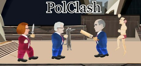
This is a 2D Brawler. Select from up to 3 iconic Australian locations for you and a friend (co-op) to brawl it out with past prime ministers. Select from past prime ministers such as Julia, John, Kevin and Tony.
Free to Play5 user reviews
ActionPoliticalBeat 'em up
KanserReverie, DecyMechyApr 9, 2025