Hand of Hexes scores 72/100 — better than 44% of Strategy capsules (n=5,103).

Quick text summary

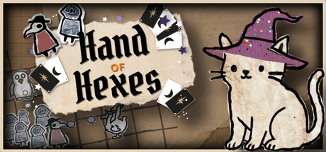
Hand of Hexes scored 72/100 on Steam Analyzer — Good for a Strategy capsule. Top priority fix: [composition] Simplify or remove the bottom-left icon cluster; consolidate secondary elements into a single cohesive accent or relocate them to less-prime real estate to reduce clutter at TINY size

Capsule scores by dimension

  • Genre Clarity: 7/10 — Quirky magic card strategy game. The hand-drawn witch cat with a purple hat and the spell-casting visual language (magical symbols, tower elements bottom-left) clearly signal a magic-themed strategy or puzzle game. At TINY size, the witch cat remains the dominant focal point and the whimsical art style suggests casual strategy rather than action, which aligns with the card-spell mechanic. The tower icons reinforce tower defense or maze-building gameplay.
  • Title Readability: 8/10 — Clear, legible serif title. The 'hand of Hexes' title is rendered in a bold, serif font with strong black-to-cream contrast against a light parchment-textured background. At SMALL size the text remains fully readable with clear letterforms and appropriate sizing. At TINY size, the title compresses but remains decipherable due to the weight and contrast, though fine serifs blur slightly.
  • Contrast & Color: 7/10 — Good separation with warm palette. The cream parchment title area, tan background, purple witch hat, and white cat create distinct value separation against the dark Steam background. The purple hat and black outlines provide the strongest silhouette definition at TINY size. In grayscale, the witch cat and title region maintain clear separation from the mottled brown backdrop, though the lower-left tower cluster blends somewhat into the murk.
  • Uniqueness & Polish: 7/10 — Charming hand-drawn aesthetic. The hand-drawn art style, whimsical witch cat protagonist, and playful parchment title treatment feel distinctly crafted and cohesive rather than templated. The visual identity communicates a cozy, quirky magic game with personality. However, the lower-left tower and icon cluster feels somewhat scattered and less polished than the central character and title, reducing the premium finish.
  • Brand Consistency: 7/10 — Consistent whimsical art direction. The hand-drawn black-line style, muted earth-tone palette, and cute anthropomorphic protagonist create a recognizable internal brand identity. The parchment texture, serif typography, and playful magical iconography reinforce a cohesive 'quirky spellcaster' theme. Without access to the 8 store screenshots, this consistency cannot be verified across assets, but the capsule alone feels self-aware and intentional.
  • Composition: 7/10 — Clear focal point, some clutter below. The witch cat occupies the strong right-center focal point with the title anchored left-center, creating clear hierarchy and balance at all sizes. At TINY size, the cat silhouette and title remain the primary read with strong focal pull. The lower-left tower cluster and spell icons add thematic context but create minor visual clutter; they compress into noise at TINY size but do not interfere with the core message.

What works

  • Strong central character focal point. The white witch cat with purple hat dominates the composition and reads clearly as the protagonist even at TINY size, creating immediate visual interest and memorability.
  • Readable parchment-anchored title. The cream parchment background isolates the 'hand of Hexes' text, ensuring legibility and preventing title-from-background collapse at small sizes.
  • Cohesive hand-drawn art style. The consistent black-outline illustration style and warm, muted palette feel unified and intentional, avoiding template-like or cheap-asset appearance.

What hurts the capsule

  • Lower icon cluster becomes visual noise. The tower icons, spell symbols, and small character silhouettes in the bottom-left compress into an unclear, cluttered mass at SMALL and TINY sizes, diluting the clean composition.
  • Limited color saturation and pop. The warm browns, tans, and muted purples lack the saturation punch seen in top-performing genre capsules, making it blend slightly against the dark Steam background during quick scrolls.
  • Ambiguous gameplay communication. While the witch hat signals magic, the card-spell-tower maze mechanic is not clearly implied visually; the capsule reads as 'cute magic game' but does not distinctly communicate the deck-building or tower-placement gameplay.

Priority fixes

  1. [composition] Simplify or remove the bottom-left icon cluster; consolidate secondary elements into a single cohesive accent or relocate them to less-prime real estate to reduce clutter at TINY size
  2. [contrast_color] Increase saturation on the witch hat (deeper purple) and add a subtle glow or outline to the cat to increase pop against #1b2838 during quick scroll
  3. [genre_clarity] Add a single gameplay hint, such as a visible card or spell beam near the cat, to more clearly signal the card-spell-tower strategy mechanic

Store copy priority fixes

  1. [hook_strength] Rewrite the opening to lead with path control: 'Control enemy routes by building deadly tower mazes—then buff them with spell cards in this roguelite deckbuilder.'
  2. [feature_communication] Add a concrete example of deck synergy or tower interaction: 'Combine direction-locked towers with spell buffs to create unstoppable kill zones, then adapt your deck for harder procedural maps.'
  3. [audience_targeting] Insert an explicit audience signal early: 'For roguelike deck-builders who love tactical tower defense' or 'If you loved [tower defense + card game], this blends both.'

Related guides

  • Steam page optimisationCapsule, copy, screenshots, tags — the full Steam page conversion stack.
  • Steam tags guideTag selection, ordering, and how it shapes Steam's recommendation rails.

Steam app ID: 3238220 · Tags: Strategy, Tower Defense, Tactical, Card Battler, Roguelite