Scoring genre clarity...

The Forbidden Flask capsule

The Forbidden Flask

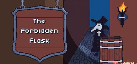
In a kingdom that has outlawed potion making, an Alchemist turned brew-master continues to sell potions on the underground market from the back of their tavern. Serve both ale and potions to customers, but don't get caught selling potions when the guards make their rounds!

$5.99Positive(10)
Strategy2DPixel Graphics
Qowface, Thorge007Oct 22, 2025

The Forbidden Flask scores 68/100 — better than 18% of Strategy capsules (n=5,103).

Positive (10 reviews) · $5.99 · Released Oct 22, 2025 · By Qowface

Quick text summary

The Forbidden Flask scored 68/100 on Steam Analyzer — Solid for a Strategy capsule. Top priority fix: [genre_clarity] Add a visual cue that signals the strategy/management mechanic, such as a customer silhouette at a table, a choice indicator, or a UI element hinting at decision-making.

Capsule scores by dimension

  • Genre Clarity: 7/10 — Tavern theme clear, genre ambiguous. The pixel art barrel, torch, and tavern setting immediately communicate a fantasy/medieval theme with potion-making undertones. However, at tiny size the Strategy gameplay loop is not visually evident—it reads more like Adventure or Management sim. The visual hook is thematic but does not clearly signal the strategic decision-making core that distinguishes this from narrative-driven indie games.
  • Title Readability: 8/10 — Strong readable shield framed title. The white serif text 'The Forbidden Flask' sits centered in a prominent blue-bordered shield frame with solid brown background, ensuring excellent contrast and legibility at all sizes down to tiny. The frame provides visual containment and the text remains crisp even when squinted. No secondary tagline clutter compromises clarity.
  • Contrast & Color: 7/10 — Good separation with dark palette. The blue shield frame pops firmly against the warm brown background, and the white title text has strong value separation from its container. The pixel art character and barrel on the right side read clearly against the dark navy-to-brown gradient, though the overall palette skews warm-dark and does not have the bright pop of top-tier genre peers. At tiny size elements remain distinguishable but lack the punchy silhouette clarity seen in Balatro or DAVE THE DIVER.
  • Uniqueness & Polish: 6/10 — Competent pixel art, generic tavern setup. The pixel art is clean and well-executed with consistent color blocking and readable 8-bit aesthetic. However, the scene—alchemist, barrel, torch—is a fairly stock medieval fantasy tavern tableau without a distinctive visual hook or memorable mechanical signal that sets it apart from dozens of similar indie games. The shield frame is a nice touch but does not compensate for the generic thematic presentation.
  • Brand Consistency: 6/10 — Cohesive pixel palette, minimal identity. The warm brown, dark blue, and gold tones form a coherent internal palette, and the pixel art style is consistent throughout the frame. However, there are no iconic characters, motifs, or signature visual elements that would make this capsule instantly recognizable as 'The Forbidden Flask' versus any other tavern-themed indie title. The shield badge is functional branding but not distinctive.
  • Composition: 7/10 — Well-balanced asymmetric layout. The shield occupies the left third with centered title, while the tavern scene anchors the right two-thirds with clear focal depth: foreground character, midground barrel, background torch. The composition guides the eye left-to-right and avoids dead space or clutter. At small and tiny sizes the shield remains the primary anchor, though the right-side details compress slightly and the character silhouette loses some nuance below 120px width.

What works

  • Legible title in strong container. The shield frame and white serif text ensure the title reads crisply at all sizes from full header down to tiny thumbnail without loss of clarity.
  • Clean pixel art craft. Consistent color palette, well-defined sprites, and readable 8-bit style convey a polished indie pedigree across the full image.
  • Balanced asymmetric composition. Shield on left, tavern scene on right creates natural visual flow with clear foreground-midground-background layering that avoids clutter.

What hurts the capsule

  • Generic tavern iconography. Barrel, torch, and cloaked figure are common medieval-fantasy stock assets with no distinctive visual storytelling that hints at the unique 'underground potion market' or strategy gameplay loop.
  • Muted color contrast against Steam bg. The warm brown and dark blue palette blends somewhat into the dark Steam background (#1b2838); it lacks the bright saturation or strong value pop of top-tier indie capsules that stand out in quick scroll.
  • Strategy genre unclear from visuals. At tiny size, the image reads as adventure or management narrative rather than strategy, failing to communicate the decision-making and customer-management core that should differentiate this game.

Priority fixes

  1. [genre_clarity] Add a visual cue that signals the strategy/management mechanic, such as a customer silhouette at a table, a choice indicator, or a UI element hinting at decision-making.
  2. [contrast_color] Introduce a brighter accent color (gold, bright orange, or cream) in the character or key focal element to increase saturation and value contrast against the dark Steam background.
  3. [uniqueness_polish] Replace or add a more distinctive character design or a signature visual motif (potion bottle, forbidden mark, or alchemist emblem) that becomes the brand identity for future marketing and screenshots.

Store copy priority fixes

  1. [genre_clarity] Rewrite the short description to include an explicit roguelike or run-based structure signal, e.g., 'Each night, brew potions and serve customers; each morning, avoid the guards—but if you're caught, start over' to clarify the loop.
  2. [feature_communication] Expand the detailed description to briefly explain one core mechanic, such as how brewing works (recipes, ingredients, time management) or how guard detection is triggered, so players understand moment-to-moment gameplay.
  3. [audience_targeting] Add a sentence identifying the core audience, such as 'Perfect for fans of management roguelikes and strategy-driven narrative games' or 'If you enjoyed Inscryption or Dune Spice Wars, you'll recognize the risk-reward decision-making here.'
  4. [uniqueness] Clarify what 'contracts with the all-seeing Eye' adds to gameplay beyond flavor—if this is a unique bargain/sacrifice system, state it explicitly so players understand the differentiation.

Related guides

  • Steam page optimisationCapsule, copy, screenshots, tags — the full Steam page conversion stack.
  • Steam tags guideTag selection, ordering, and how it shapes Steam's recommendation rails.

Steam app ID: 3243410 · Tags: Strategy, 2D, Pixel Graphics, Top-Down, Fantasy