Scoring genre clarity...
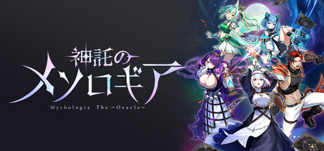
”Mythologia the Oracle” is a brand-new digital card battle featuring fully revealed hands and a simultaneous turn system. In fast-paced 3-minute matches using three types of cards, read your opponent’s strategy, control the board with your chosen cards, and claim victory.
Free to PlayMixed(22)
CasualStrategyCard Game
株式会社ネコノメApr 14, 2026