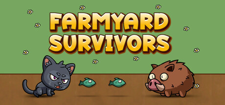
Farmyard Survivors scores 77/100 — better than 75% of Casual capsules (n=10,153).

Quick text summary

Farmyard Survivors scored 77/100 on Steam Analyzer — Good for a Casual capsule. Top priority fix: [uniqueness_polish] Introduce a distinctive visual element that communicates the roguelite or lane-based mechanic—consider adding lane dividers, tower placement hints, or a signature weapon/defense item that differentiates from generic cute animal games.

Capsule scores by dimension

  • Genre Clarity: 8/10 — Clear casual roguelite with cute aesthetic. The pixel art style, adorable animal characters, and farm setting immediately signal a casual game with light-hearted tone. At tiny size, the cute cat and pig characters are recognizable silhouettes that communicate family-friendly gameplay. The roguelite/tower defense mechanics are less obvious from visuals alone, but the overall presentation clearly avoids hardcore or competitive genres.
  • Title Readability: 9/10 — Bold yellow title highly legible at all sizes. FARMYARD SURVIVORS uses a thick, bold yellow font with strong dark outline and drop shadow that maintains clarity from full size down to tiny thumbnail. The title is centered in the upper half on a clean green background with no competing visual noise, ensuring readable letterforms and spacing even at 120x45 pixel size. The font weight and contrast strategy is exemplary for discoverability.
  • Contrast & Color: 8/10 — Strong value separation with vibrant palette. The bright yellow title pops sharply against the muted sage green background, and the dark pixel characters create clear silhouettes against the lighter grass. In grayscale, the yellow-to-green value shift remains distinct, and character outlines hold definition even at tiny size. The warm brown earth stripe grounds the composition without muddying the overall contrast.
  • Uniqueness & Polish: 7/10 — Charming pixel art with generic composition. The hand-drawn pixel art style is clean and appealing with expressive character design, particularly the grumpy cat and chubby pig faces that convey personality. However, the static symmetrical character lineup against a simple background feels relatively conventional for the casual roguelite space compared to top-tier peers like Balatro or Little Kitty, Big City. The visual hook is cute characters rather than a distinctive mechanical or thematic innovation communicated visually.
  • Brand Consistency: 6/10 — Consistent pixel style, limited identity markers. The pixel art rendering, color palette, and character design maintain internal cohesion across the composition, suggesting professional craft. However, without reference to store screenshots, there are no distinctive brand symbols, recurring motifs, or signature visual elements that would make this capsule immediately recognizable as this specific game versus other cute animal casual games. The style is competent but not yet iconic.
  • Composition: 8/10 — Balanced focal point with clear hierarchy. The title dominates the upper third with the character pair anchoring the lower section, creating natural visual hierarchy and balance. At small and tiny sizes, the composition remains readable with no crowded clutter, and the characters are spaced well within safe margins to avoid Steam crop issues. The floating particle elements (small bug icons) are small enough not to distract from the primary message.

What works

  • Exceptional title contrast and legibility. Yellow bold font with dark outline maintains perfect readability from full size to tiny 120x45 thumbnail.
  • Expressive character design with personality. The grumpy cat and chubby pig faces immediately communicate tone and charm at all viewing sizes.
  • Clean composition with clear visual hierarchy. Strong separation between title area and character area prevents visual noise and guides eye movement effectively.

What hurts the capsule

  • Generic scene layout lacking visual distinction. Static symmetric character lineup against simple background does not communicate unique gameplay hook or stand out in casual roguelite genre.
  • Limited brand identity markers. No distinctive symbols, recurring visual motifs, or signature palette elements that would make this recognizable as this specific game on repeat exposure.
  • Decorative particle elements feel supplementary. The small bug icons scattered across the scene add minor charm but don't reinforce core mechanics or improve visual storytelling.

Priority fixes

  1. [uniqueness_polish] Introduce a distinctive visual element that communicates the roguelite or lane-based mechanic—consider adding lane dividers, tower placement hints, or a signature weapon/defense item that differentiates from generic cute animal games.
  2. [brand_consistency] Develop a recognizable brand motif or palette signature visible in the capsule that will carry across store screenshots and marketing materials for consistent identity.
  3. [genre_clarity] Add subtle UI elements (health bar, lane structure, or recruitment UI) in corner that hint at roguelite/tower defense mechanics without cluttering the cute aesthetic.

Store copy priority fixes

  1. [uniqueness] Add one sentence to the short description that articulates the core differentiator (e.g., 'defend your farm with adorable animal heroes in this uniquely charming lane-defense roguelite' or similar).
  2. [feature_communication] Rewrite the Features list to embed each feature into a short narrative sentence rather than bullet points (e.g., 'Master six skills and deploy them across five lanes of action' instead of two separate bullets).
  3. [audience_targeting] Add a closing line in the detailed description that explicitly addresses the intended player: 'Perfect for casual players seeking short, rewarding runs packed with charm.'

Related guides

Steam app ID: 3252160 · Tags: Casual, Cute, Roguelite, 2D, Cats