Scoring genre clarity...
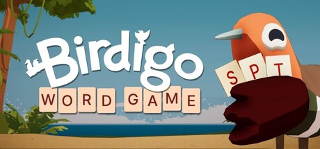
A word game about migrating birds - inspired by Wordle and Balatro. Play cards, build your deck, trigger combos and guide your flock. From John August (Corpse Bride) and Corey Martin (Bonfire Peaks).
$9.99Very Positive(79)
Word GameRoguelikeDeckbuilding
John August, Corey MartinJul 30, 2025