Scoring genre clarity...

Puzzles in Otter Space capsule

Puzzles in Otter Space

Don your spacesuit to teleport and super-jump your way through 90 brain-teasing platform puzzles.

$6.997 user reviews
2D PlatformerCasualPuzzle Platformer
Dominic Louey, Connor Moodie, Joseph Kim, Brian Nguyen, Katie Ng, Angus Yu, Alex YannopoulosJan 2, 2026

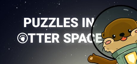
Puzzles in Otter Space scores 75/100 — better than 68% of 2D Platformer capsules (n=1,970).

7 user reviews · $6.99 · Released Jan 2, 2026 · By Dominic Louey

Quick text summary

Puzzles in Otter Space scored 75/100 on Steam Analyzer — Good for a 2D Platformer capsule. Top priority fix: [title_readability] Reflow title to single line or reposition to avoid awkward 'IN' line break, ensuring tighter visual grouping of 'PUZZLES IN OTTER SPACE'

Capsule scores by dimension

  • Genre Clarity: 8/10 — Cute puzzle platformer in space. The otter in a spacesuit with a helmet immediately signals a whimsical puzzle-platformer game. The space setting is reinforced by the starfield background and the character's sci-fi gear. At tiny size, the otter silhouette and helmet are still recognizable, though the exact genre (puzzle vs. action) becomes slightly ambiguous without clearer UI hints.
  • Title Readability: 7/10 — Clear but split across lines. The title 'PUZZLES IN OTTER SPACE' is rendered in clean, bold white sans-serif font with good contrast against the dark starfield background. At full size it reads clearly, and at small size the words remain legible, though the line break across 'IN' and 'OTTER' creates minor visual awkwardness. At tiny size the text compresses but remains parseable due to strong weight and contrast.
  • Contrast & Color: 8/10 — Strong value separation with warm accent. The white title text pops distinctly against the dark blue-black starfield, and the otter's warm golden-brown fur with orange/yellow accents create a strong warm-cool value separation. The character's solid colors and clear silhouette read well even when squinting. The paw pad icon in the title integrates cleanly without muddying contrast.
  • Uniqueness & Polish: 7/10 — Charming character design, competent execution. The otter character has genuine personality and appeal with a well-drawn spacesuit aesthetic that feels intentional rather than generic. The art style is polished and cohesive, communicating the core appeal (cute animal + space puzzle adventure) effectively. However, the overall composition and color choices, while solid, are not distinctly memorable or innovative enough to stand apart from other indie puzzle-platformers.
  • Brand Consistency: 7/10 — Coherent style, clear identity signals. The otter character with spacesuit is a strong, recognizable brand element that could appear across marketing materials and UI. The color palette (golden-brown otter, deep space blue, warm accent colors) is consistent and would read consistently across the 10 available screenshots. The illustration style is clean and unified, establishing a memorable visual identity for the game.
  • Composition: 8/10 — Balanced focal point with strong hierarchy. The otter is positioned in the right third of the frame as a clear primary focal point, while the title occupies the upper left without competing for attention. The starfield background provides visual depth and context without overwhelming the character. Margins are safe, and the composition remains readable at small and tiny sizes with the character silhouette remaining the clear hero and the title easily scannable.

What works

  • Distinctive character charm. The otter in a spacesuit is instantly appealing and memorable, immediately communicating the game's playful tone and creating strong brand recognition potential.
  • Excellent contrast and readability. White title text and warm character colors create strong value separation against the dark starfield, ensuring legibility across all viewing sizes from full header to tiny thumbnail.
  • Clear visual hierarchy. The otter is positioned as the primary focal point with title text supporting rather than competing, creating a balanced and professional composition.

What hurts the capsule

  • Title line break awkwardness. The split between 'PUZZLES IN' and 'OTTER SPACE' creates an unnatural reading pause and visual imbalance in the upper left quadrant.
  • Generic space background. The starfield is a common placeholder aesthetic that doesn't add distinctive visual personality or communicate unique gameplay mechanics beyond the cute character.
  • Limited visual storytelling. While the otter is charming, the capsule doesn't communicate platform mechanics, puzzle elements, or gameplay hooks that differentiate it from other casual indie games.

Priority fixes

  1. [title_readability] Reflow title to single line or reposition to avoid awkward 'IN' line break, ensuring tighter visual grouping of 'PUZZLES IN OTTER SPACE'
  2. [uniqueness_polish] Add a subtle gameplay element (platform edge, puzzle block, or teleport visual effect) to communicate core mechanics and differentiate from generic space scenes
  3. [composition] Consider adding a secondary visual element (moon, planet, or puzzle artifact) to add depth and visual interest without cluttering the otter focal point

Store copy priority fixes

  1. [uniqueness] Rewrite the detailed description's opening to highlight what makes Traces special—e.g., 'Master the Traces mechanic: a dual teleport-and-jump system that transforms how you solve puzzles. Each biome adds new twists that force you to rethink your approach.' This sells the differentiation.
  2. [hook_strength] Replace 'brain-teasing' with a more specific descriptor tied to the Traces mechanic, such as 'Don your spacesuit to master teleport and super-jump mechanics across 90 cleverly designed platform puzzles.'
  3. [audience_targeting] Add a line after the feature list: 'Perfect for puzzle platformer fans and newcomers alike—adjust your difficulty by challenging yourself to solve each level with fewer Traces.' This clarifies skill levels and appeal.
  4. [tone_match] Soften or replace 'exhilarating collection' and 'treacherous challenges' with voice-specific language that mirrors the otter character—e.g., 'Navigate mind-bending biomes with the help of your trusty teleport power' feels less corporate.

Related guides

Steam app ID: 3271300 · Tags: 2D Platformer, Casual, Puzzle Platformer, Puzzle, Platformer