Scoring genre clarity...
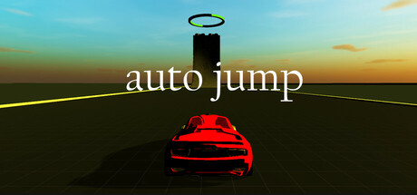
The game where gravity is optional, and your car’s paint job is the only thing holding it together. Jump, loop, and stick to walls in your quest for the goal. Fail spectacularly? Reset and pretend it never happened. It’s like driving school, but with more rollovers.
$2.491 user reviews
DrivingArcadeStylized
FTL GamesMar 4, 2025