Scoring genre clarity...
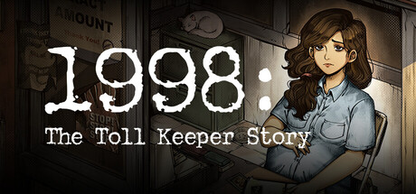
A narrative simulation game where you play as a mother-to-be working as a toll keeper in the fictional country of Janapa, a nation on the brink of chaos. Navigate daily challenges and make difficult moral choices to survive—all for the sake of your unborn child.
$11.99Very Positive(280)
SimulationInteractive FictionLife Sim
GameChanger StudioOct 28, 2025