Scoring genre clarity...
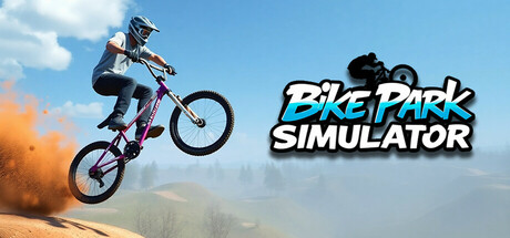
Bike Park Simulator is a realistic BMX, Dirt Jump, and MTB simulation featuring a large sandbox skatepark, multiple bike types, and fun physics-based riding. Perform tricks, explore diverse terrains, and become the most famous biker in the city!
$3.991 user reviews
BMXSimulationBikes
Hard Shark GamesMar 3, 2025