Scoring genre clarity...

Sorcery Slam capsule

Sorcery Slam

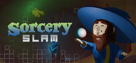
Sorcery Slam is a competitive/party puzzle game inspired by retro era classics. Play with up to 6 Sorcerers locally or online to collect powerful elemental Gems and be the first to power up your ultimate final blast for the win!

$9.99Positive(13)
CasualStrategyPuzzle
Earth Shatter GamesOct 10, 2025

Sorcery Slam scores 73/100 — better than 54% of Casual capsules (n=10,153).

Positive (13 reviews) · $9.99 · Released Oct 10, 2025 · By Earth Shatter Games

Quick text summary

Sorcery Slam scored 73/100 on Steam Analyzer — Good for a Casual capsule. Top priority fix: [composition] Adjust character position slightly left to provide safer margin clearance on right edge and improve visual breathing room.

Capsule scores by dimension

  • Genre Clarity: 7/10 — Party puzzle game clearly signaled. The cartoon sorcerer character in blue hat with wand and magical orb immediately communicates a magic/spell-casting theme, and the retro aesthetic hints at puzzle mechanics. At TINY size, the character silhouette and wand remain recognizable, though the competitive party element is less obvious without text. The whimsical art style supports casual/party game positioning over hardcore strategy.
  • Title Readability: 8/10 — Bold, legible title with contrast. The 'SORCERY SLAM' text uses yellow-green and white coloring with clear outline against the dark background, maintaining excellent readability at both FULL and SMALL sizes. At TINY size the title remains decipherable due to bold letterforms and strong value separation from the dark backdrop. The two-line layout with smaller tagline below works but the secondary text becomes illegible at tiny scale, which is acceptable for a tagline.
  • Contrast & Color: 8/10 — Strong value separation, warm tones pop. The yellow-green title, warm brown wizard character, and blue hat create distinct silhouettes against the dark teal-brown gradient background. High contrast between the character's light face and the dark background ensures the focal subject reads clearly even at TINY size. The color palette avoids muddy mid-tones and maintains clear visual separation in both color and grayscale tests.
  • Uniqueness & Polish: 7/10 — Charming retro aesthetic, competent execution. The hand-drawn style and cheerful wizard character feel intentional and distinctive compared to generic puzzle game templates, with clear personality in the character pose and expression. The magical orb and star doodles add charm and thematic coherence, though the overall scene composition remains relatively straightforward without a unique mechanical hook visually communicated. The craft is solid but not exceptional enough to stand out in a crowded indie market.
  • Brand Consistency: 7/10 — Consistent retro whimsy, recognizable character. The art style, color palette, and character design suggest internal consistency with the game's retro-inspired aesthetic and casual tone. The blue-hatted sorcerer has a memorable silhouette that could become a brand icon with repeated exposure across marketing. Without seeing all 5 screenshots, the visible doodle elements and warm palette suggest a cohesive visual identity, though no icon or symbol is distinctly iconic yet.
  • Composition: 7/10 — Clear focal point, minor spacing concerns. The sorcerer character positioned in the right-center is the clear primary subject, with the title anchored on the left creating good balance and hierarchy. The doodle elements (stars, boxes, symbols) provide secondary interest without overwhelming the composition. At TINY size the layout remains readable with the character and title both legible, though the right-side crop of the character's arm edges closer to margin safety than ideal.

What works

  • Strong title contrast and legibility. Yellow-green and white text with bold letterforms maintain excellent readability at all sizes against the dark background.
  • Clear character silhouette and personality. The blue-hatted sorcerer with wand reads instantly at TINY size and conveys the whimsical, casual tone of the game through expression and pose.
  • Cohesive retro-casual aesthetic. The hand-drawn style, color palette, and doodle elements work together to establish a recognizable visual identity aligned with the party game positioning.
  • Good value separation and depth layering. Background gradient, midground doodles, and foreground character create clear spatial hierarchy that reads well at all scales.

What hurts the capsule

  • Mechanical hook not visually obvious. The puzzle/competitive element is implied by the character but not explicitly communicated through iconic visual metaphors or game UI hints.
  • Secondary text illegible at TINY size. The 'SLAM' tagline and any smaller supporting text become unreadable at thumbnail scale, though this is a minor issue for a game where title alone suffices.
  • Right-side crop margin tight on character. The sorcerer's arm and hat edge close to the right boundary, risking awkward clipping on some Steam display widths or if the image is cropped tighter.

Priority fixes

  1. [composition] Adjust character position slightly left to provide safer margin clearance on right edge and improve visual breathing room.
  2. [uniqueness_polish] Add a subtle visual element or icon that communicates the 'competitive party' or 'multiplayer' aspect (e.g., multiple orbs, 6-player count indicator, or battle aura) to strengthen mechanical clarity.
  3. [genre_clarity] Consider incorporating a small UI frame or puzzle grid accent in the background doodles to reinforce the puzzle game identity at TINY size.

Store copy priority fixes

  1. [uniqueness] Specify which retro games inspired Sorcery Slam (e.g., 'Puyo Puyo meets Bomberman') or explicitly state what mechanic is unique (e.g., 'the only retro puzzle-party game with real-time hex attacks').
  2. [feature_communication] Restructure the detailed description to open with a bullet-point feature list: block placement, banking system, combo attacks, power meter, and difficulty scaling—then explain each.
  3. [hook_strength] Strengthen the short description opening with an action verb: 'Slam blocks, trigger combos, and hexcurse opponents in this 6-player competitive puzzle party game' to create immediate visceral appeal.

Related guides

Steam app ID: 3276960 · Tags: Casual, Strategy, Puzzle, 3D, Cartoony