Scoring genre clarity...
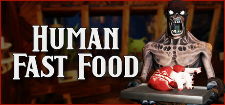
A cooking simulator where you run an underground fast food for monsters and serve them with human meat. Improve your kitchen appliances, unlock new recipes, manage your stock and keep the monsters well fed.
$5.24Very Positive(79)
SimulationCookingTime Management
Bricchi GamesApr 24, 2025