Scoring genre clarity...

Ed & Edda: GRAND PRIX – Racing Champions capsule

Ed & Edda: GRAND PRIX – Racing Champions

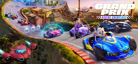
Ed & Edda: GRAND PRIX – Racing Champions is a fun racing game for the whole family that brings the famous mascots of the Europa-Park to life. Players can – either alone or with their friends – race through several European landmarks to find out who is the fastest!

$39.994 user reviews
ActionRacing4 Player Local
Tivola Games GmbH, Funatics SoftwareJul 24, 2025

Ed & Edda: GRAND PRIX – Racing Champions scores 77/100 — better than 79% of Action capsules (n=8,534).

4 user reviews · $39.99 · Released Jul 24, 2025 · By Tivola Games GmbH

Quick text summary

Ed & Edda: GRAND PRIX – Racing Champions scored 77/100 on Steam Analyzer — Good for a Action capsule. Top priority fix: [title_readability] Enlarge and simplify the title wordmark to remain legible at 120×45 by reducing decorative elements and increasing letter spacing—prioritize 'GRAND PRIX' core branding over full subtitle.

Capsule scores by dimension

  • Genre Clarity: 9/10 — Racing game immediately obvious. Multiple colorful racing vehicles on a track with clear motion blur, vibrant neon elements, and competitive positioning instantly communicate arcade racing at TINY size. The track environment, vehicle density, and dynamic staging unmistakably establish this as a family-friendly kart racer. Genre signals remain sharp even at 120×45 resolution.
  • Title Readability: 7/10 — Title readable at full size only. The 'ED & EDDA: GRAND PRIX' logo in the upper right is legible at full header size with clean white lettering and a checkered flag banner accent. At SMALL size (231×87) the text becomes compressed but still traceable; at TINY size (120×45) individual letterforms blur and become difficult to parse without prior knowledge. The tagline 'Racing Champions' is largely unreadable at small sizes due to size constraints.
  • Contrast & Color: 8/10 — Vibrant vehicles pop strongly. Bright neon blues, purples, reds, and yellows of the racing vehicles create excellent value separation against the darker sky and track background on Steam's dark #1b2838 background. The vehicles maintain clear silhouettes even at TINY size due to saturated color choices and strong rim lighting. However, some mid-tone yellow-orange gradients in the track/environment blend slightly with lighter sky areas when squinting.
  • Uniqueness & Polish: 7/10 — Polished family racer aesthetic. The capsule demonstrates solid craft with dynamic composition, depth layering (track swoops into distance), and motion effects (speed lines, blur trails) that feel intentional and cohesive. The mascot-driven Europa-Park theming provides a unique hook compared to generic racing games, though the visual execution follows familiar arcade racer conventions. The overall presentation feels premium but not groundbreaking within the competitive racing capsule landscape.
  • Brand Consistency: 7/10 — Consistent character and color identity. The bright neon palette, curved track design, and visible mascot characters (Ed & Edda) provide recognizable brand cues that tie to Europa-Park's aesthetic. Vehicle designs and the vibrant color scheme remain consistent with arcade family racing expectations. The checkered flag banner reinforces racing identity, though without access to other materials, internal identity strength is moderate rather than iconic.
  • Composition: 8/10 — Strong layered hierarchy and focus. The composition uses excellent depth layering with a curved track spiraling into the background, vehicles positioned across multiple planes, and the title anchored in the upper right where it remains safe from Steam cropping. The primary focal point—the blue lead vehicle and central track—draws attention immediately while supporting vehicles guide the eye. At SMALL and TINY sizes the layout remains readable with no dead zones, though the title compression is the only minor weakness.

What works

  • Excellent genre communication. Racing vehicles, track environment, motion blur, and neon styling instantly signal arcade kart racing even at minimal thumbnail size.
  • Strong color contrast and vehicle visibility. Saturated vehicle colors maintain silhouette clarity against the dark Steam background and bright sky, with rim lighting enhancing separation at all sizes.
  • Effective depth and layering. Multiple vehicle planes and the spiraling track create visual hierarchy that guides attention and prevents flatness despite busy composition.
  • Safe title placement and layout. Logo positioned in upper right avoids edge cropping and remains legible at full size while composition balances supporting elements effectively.

What hurts the capsule

  • Title unreadable at TINY size. The 'ED & EDDA: GRAND PRIX' text compresses to illegibility at 120×45 resolution, relying entirely on prior brand recognition.
  • Tagline and secondary text collapse. 'Racing Champions' tagline becomes completely unreadable at small sizes, adding no value and wasting real estate.
  • Busy composition risks element collision. Multiple vehicles and track elements create visual density that, while readable now, leaves little margin for error if composition shifts slightly.

Priority fixes

  1. [title_readability] Enlarge and simplify the title wordmark to remain legible at 120×45 by reducing decorative elements and increasing letter spacing—prioritize 'GRAND PRIX' core branding over full subtitle.
  2. [title_readability] Remove or relocate the 'Racing Champions' tagline to reduce visual clutter and ensure the primary title is the only small-size readable text element.
  3. [composition] Add a semi-transparent dark overlay or vignette behind the title area to ensure maximum contrast and readability at all sizes without competing with vehicle visuals.

Store copy priority fixes

  1. [hook_strength] Rewrite the short description to lead with the core mechanic or competitive draw: replace 'who is the fastest' with a verb-forward phrase that emphasizes the action (e.g., 'Race across Europe, master boost techniques, and challenge up to three friends in chaotic four-player split-screen battles').
  2. [uniqueness] Add one sentence explaining what makes the boost system or character strengths mechanically distinct or interesting compared to other family racers (e.g., 'Each character's unique abilities completely change race strategy').
  3. [feature_communication] Clarify what boost techniques do and how they affect gameplay—are they timed button presses, resource management, or automatic speed surges? Specificity will help players understand the depth.
  4. [tone_match] Inject more playful, energetic language to match the cartoony art style: replace corporate phrasing like 'Parallel to the worldwide cinema release' with snappier, action-oriented copy that feels like it's written for kids and families.

Related guides

Steam app ID: 3288920 · Tags: Action, Racing, 4 Player Local, Arcade, 3D