Scoring genre clarity...
Scoring genre clarity...
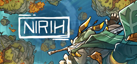
Nirih scores 73/100 — better than 50% of Racing capsules (n=790).
5 user reviews · $11.99 · Released Dec 5, 2025 · By ShippableGames
Nirih scored 73/100 on Steam Analyzer — Good for a Racing capsule. Top priority fix: [genre_clarity] Add subtle speed lines or motion blur around the character to emphasize the racing/boost mechanic and clarify the speed-focused gameplay.
Steam app ID: 3291700 · Tags: Racing, Precision Platformer, Combat Racing, Runner, Difficult