Stuck Together scores 78/100 — better than 80% of Co-op capsules (n=1,513).

Quick text summary

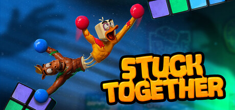
Stuck Together scored 78/100 on Steam Analyzer — Good for a Co-op capsule. Top priority fix: [uniqueness_polish] Emphasize the core co-op mechanic visually (e.g., show the physical connection or constraint between the two toys) to communicate the unique selling point more immediately.

Capsule scores by dimension

  • Genre Clarity: 8/10 — Clear action-adventure gameplay cues. The dynamic pose of the toy character mid-jump with colorful blocks suggests platforming or puzzle-action mechanics. The playful character design and co-op visual language (paired toys) communicate indie action-adventure identity clearly. At tiny size, the action pose and bright character silhouette still read as energetic gameplay rather than narrative-focused or strategy genres.
  • Title Readability: 9/10 — Bold, legible title with strong contrast. STUCK TOGETHER is rendered in large, bright yellow lettering with a thick black outline positioned in the lower right against darker background regions. The text maintains excellent readability at full size, small capsule, and even at tiny thumbnail scale due to high value contrast and generous letter spacing. No additional text competes with the title, ensuring it remains the dominant text element.
  • Contrast & Color: 8/10 — Strong value separation and saturation. The warm orange-yellow toy character pops distinctly against the cool blue-green gradient background, creating excellent silhouette clarity. Bright neon blocks (purple, green, cyan) add layered visual interest without muddying the primary subject. Even in grayscale mental test, the character and title maintain clear edge separation from the background gradient.
  • Uniqueness & Polish: 7/10 — Polished character design, somewhat familiar concept. The expressively animated toy character with visible joints and exaggerated proportions shows quality rigging and personality. The colorful block elements and playful visual language feel intentional and well-crafted rather than generic. However, the co-op toy escape concept, while well-executed, aligns with familiar indie game tropes and does not communicate a singular mechanical innovation that would make it truly distinctive versus peers like Cocoon or Viewfinder.
  • Brand Consistency: 7/10 — Recognizable toy aesthetic, consistent palette. The warm-toned articulated toy character and vibrant neon block motifs establish a cohesive visual identity that should translate across store assets. The color palette (warm orange, cool blue-green, bright neon accents) is distinctive enough to support brand recall. Internal rendering style is polished and consistent throughout the visible composition, though the toy character design itself is not yet iconic enough to guarantee standalone recognition without context clues.
  • Composition: 8/10 — Clear focal point, balanced depth layering. The toy character occupies center-left space as the primary focal point with strong upward momentum that draws the eye naturally. Colorful blocks are distributed as secondary elements that guide composition without competing for attention. The title anchors the lower right, creating a balanced triangular arrangement that works well at small and tiny sizes; safe margins keep all critical elements away from probable crop boundaries.

What works

  • Excellent title contrast and legibility. Yellow text with black outline remains readable and visually striking even at thumbnail size against the dark Steam background.
  • Strong color separation and silhouette. Warm toy character pops clearly from the cool blue-green gradient, with bright accent blocks adding visual depth and intrigue without clutter.
  • Clear focal point and composition. Character pose and placement naturally guide the eye with no competing elements; blocks and title support rather than distract from the primary subject.
  • Polished character design and animation. The toy articulation, expression, and dynamic pose communicate personality and quality craftsmanship that suggests a well-made indie game.

What hurts the capsule

  • Generic indie game concept framing. The co-op toy escape story, while well-presented, does not immediately communicate a unique mechanical hook that distinguishes it from other colorful indie puzzlers.
  • Limited iconic brand identity. While the toy character is charming, no singular motif or symbol emerges as a memorable brand anchor that would enable instant recognition across store pages.
  • Neon block visual language feels familiar. Bright colored geometric shapes are common in indie puzzle and platformer games, diluting the distinctiveness of the visual presentation.

Priority fixes

  1. [uniqueness_polish] Emphasize the core co-op mechanic visually (e.g., show the physical connection or constraint between the two toys) to communicate the unique selling point more immediately.
  2. [brand_consistency] Develop a signature visual motif (a repeated symbol, character expression, or object) that will anchor brand identity and improve recognition across store assets.
  3. [genre_clarity] Ensure store screenshots and additional assets reinforce the action-climbing gameplay loop so the capsule positioning is validated by in-game visuals.

Store copy priority fixes

  1. [feature_communication] Add a structured feature list or bullet points under "What's Included" covering: physics-based climbing mechanics, 6 unique rooms/hazards, online and local co-op modes, easy/normal difficulty options, and the stuck-together duo system's core mechanic.
  2. [uniqueness] Explicitly explain how being stuck together affects gameplay—do you move as one unit, require synchronized input, or share health?—to differentiate from generic co-op platformers.
  3. [genre_clarity] Move or clarify the psychological horror elements earlier or acknowledge them as tonal seasoning rather than primary genre, since the bulk of copy leans comedy and challenge over horror.

Related guides

Steam app ID: 3295360 · Tags: Co-op, Adventure, Difficult, Platformer, Funny