Scoring genre clarity...

Carnegie capsule

Carnegie

In Carnegie, players will recruit employees and expand their businesses by investing in real estate, producing goods, developing transport technology, and creating transport chains across the United States.

$9.997 user reviews
StrategyBoard GameSolitaire
ycyclop gamesApr 8, 2025

Carnegie scores 67/100 — better than 15% of Strategy capsules (n=5,103).

7 user reviews · $9.99 · Released Apr 8, 2025 · By ycyclop games

Quick text summary

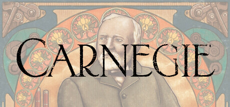
Carnegie scored 67/100 on Steam Analyzer — Solid for a Strategy capsule. Top priority fix: [genre_clarity] Add a subtle background element such as a railroad, industrial skyline, or economic chart to immediately communicate strategy and business simulation theme without compromising the historical aesthetic.

Capsule scores by dimension

  • Genre Clarity: 5/10 — Historical setting unclear on strategy intent. The capsule shows a 19th-century portrait and ornate decorative frame that suggest economic strategy or business simulation, but the visual language reads more as historical biography or educational content than dynamic strategy gameplay. At tiny size, the ornamental design and sepia tones obscure any explicit game mechanic cues like grids, maps, or production chains that would reinforce strategy genre identity.
  • Title Readability: 8/10 — Strong serif typography legible at all sizes. CARNEGIE in bold, elegant serif capitals reads clearly even at tiny thumbnail size due to high contrast black text against the light cream background. The font choice is intentional and supports the historical brand identity, though the ornamental frame competes for attention at full size without compromising core word legibility.
  • Contrast & Color: 7/10 — Warm palette with adequate value separation. The sepia, cream, and muted blue-green palette creates sufficient contrast against Steam's dark background through warm mid-to-light tones in the upper frame and portrait area. At tiny size the design reads with acceptable clarity, though the muted color scheme is less aggressive than top-tier strategy capsules; grayscale squint test shows the portrait and ornamental elements hold separation, but just barely.
  • Uniqueness & Polish: 7/10 — Polished historical aesthetic distinct from peers. The capsule commits to a cohesive Art Nouveau–inspired aesthetic with ornate decorative borders, period-appropriate color grading, and a dignified portrait that differentiates it from typical strategy game capsules heavy on maps or unit imagery. This refined approach feels intentional and premium, though it risks appearing more like historical reference material than an interactive business strategy title, which may not communicate the core gameplay loop as effectively as competitors.
  • Brand Consistency: 7/10 — Consistent historical design identity established. The ornate frame, sepia palette, serif typography, and portrait styling create a recognizable visual signature aligned with a 19th-century industrialist theme. Without viewing additional store screenshots, the internal cohesion is strong—all elements support a unified historical business aesthetic—though the identity relies on historical cues rather than iconic game-specific motifs that might appear across multiple branded materials.
  • Composition: 6/10 — Centered portrait with ornamental framing. The composition centers on a dignified portrait flanked by symmetric ornamental borders and corner flourishes, creating visual balance but leaving the top and bottom regions somewhat vacant at full size. The title placement above the portrait is clean, but at tiny size the ornamental frame detail collapses into visual noise, and the overall layout feels static and gallery-like rather than dynamic; the central focal point works but lacks the depth layering and energy typical of top-tier strategy capsules.

What works

  • Clear, legible title at all scales. CARNEGIE in strong serif font maintains readability from full size down to tiny thumbnail due to high contrast and intentional letterform spacing.
  • Cohesive historical aesthetic. The Art Nouveau ornamental frame, period color palette, and dignified portrait create a unified and premium visual identity that stands apart from typical strategy game imagery.
  • Strong value contrast on dark Steam background. The warm cream and sepia tones provide sufficient pop against #1b2838, ensuring the capsule reads at quick-scroll speeds without being lost.

What hurts the capsule

  • Ornamental detail collapses at tiny size. The intricate corner flourishes and decorative borders reduce to visual clutter at small and tiny thumbnail sizes, competing with the title rather than supporting hierarchy.
  • Genre intent unclear from visuals alone. The historical portrait and gallery-like framing communicate biography or educational content more strongly than strategy gameplay; no explicit cues hint at business simulation, production chains, or economic mechanics.
  • Static composition lacks dynamic energy. The centered symmetrical layout and portrait-focused focal point feel more like museum display than interactive game, missing the compositional dynamism common in top-tier strategy titles.
  • Muted saturation reduces genre category pop. The soft sepia and desaturated palette, while polished, lacks the visual punch that helps strategy titles stand out in crowded store lists compared to colorful competitors like Age of Wonders 4.

Priority fixes

  1. [genre_clarity] Add a subtle background element such as a railroad, industrial skyline, or economic chart to immediately communicate strategy and business simulation theme without compromising the historical aesthetic.
  2. [contrast_color] Increase saturation or add accent lighting (warm gold edges on the portrait or frame) to make the capsule pop more distinctly against the Steam dark background in quick-scroll scenarios.
  3. [composition] Introduce layered depth—position the portrait in mid-ground with a faded historical cityscape or infrastructure elements in the background to create visual hierarchy and reduce the gallery-flat aesthetic.
  4. [uniqueness_polish] Refine ornamental elements or move them away from corners where they are lost at tiny size; consider a top banner badge or stamp-like accent that remains readable at all sizes and reinforces brand identity.

Store copy priority fixes

  1. [hook_strength] Replace the opening line with a specific, action-oriented hook: e.g., 'Build America's industrial empire: invest in steel, railways, and trade chains in this solo strategy game where every choice shapes your legacy.'
  2. [tone_match] Move the Andrew Carnegie biography to an optional 'Inspiration' section at the end or remove it entirely; lead with game mechanics and tone instead to match a strategic board game audience.
  3. [uniqueness] Add 1–2 sentences explaining what makes this digital adaptation distinct—e.g., difficulty scaling, AI opponent mechanics, or unique features not in the physical game—to differentiate it in a crowded strategy space.
  4. [feature_communication] Expand the description of resource interactions and strategic depth; clarify how real estate, goods, and transport chains create meaningful decisions and tension with the automata opponent.

Related guides

  • Steam page optimisationCapsule, copy, screenshots, tags — the full Steam page conversion stack.
  • Steam tags guideTag selection, ordering, and how it shapes Steam's recommendation rails.

Steam app ID: 3297500 · Tags: Strategy, Board Game, Solitaire, 2D, Resource Management