Scoring genre clarity...
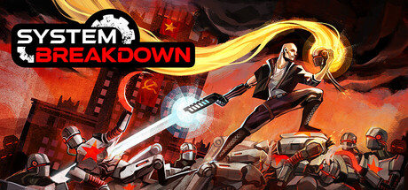
System Breakdown capsule

System Breakdown

Brutal, fast-paced twin-stick shooter, where you fight with Soviet war machines. Cycle between guns, use power-ups to destroy robot armors and unleash your ultimate ability. They won’t have mercy, neither should you!

Twin Stick ShooterDifficultDystopian
Anarchy CreationsAugust 2026

System Breakdown scores 73/100 — better than 49% of Twin Stick Shooter capsules (n=293).

Released August 2026 · By Anarchy Creations

Quick text summary

System Breakdown scored 73/100 on Steam Analyzer — Good for a Twin Stick Shooter capsule. Top priority fix: [brand_consistency] Introduce or emphasize a distinctive visual element (iconic enemy design, signature character silhouette, or unique weapon effect) that appears consistent across store screenshots and becomes the System Breakdown visual signature.

Capsule scores by dimension

  • Genre Clarity: 8/10 — Action shooter clearly telegraphed. The central character in dynamic combat pose wielding a glowing weapon against robot enemies immediately signals action-shooter gameplay. At TINY size, the golden energy effect, aggressive stance, and silhouettes of mechanical enemies remain readable and reinforce the twin-stick shooter identity without ambiguity.
  • Title Readability: 7/10 — Bold logo with minor size concerns. The title uses strong contrast with white 'SYSTEM' and red 'BREAKDOWN' text set against a dark background, maintaining legibility at SMALL size. At TINY size (120x45), the text remains visible but becomes tight; the design works because of the stark color separation and logo placement in the upper-left safe zone, though fine letterforms blur slightly.
  • Contrast & Color: 8/10 — Warm palette pops against dark Steam background. Gold, orange, and red tones create strong luminosity separation against the #1b2838 Steam background, with the central character and energy effects reading crisply at all sizes. The grayscale test shows clear value separation between the figure, the warm glow effects, and the cooler red-tinted background, maintaining silhouette clarity even at TINY scale.
  • Uniqueness & Polish: 7/10 — Polished execution with familiar tropes. The dynamic action pose, glowing combat effects, and Soviet robot aesthetic show strong craft and intentional art direction. While the overall composition follows action-game conventions seen in comparable titles, the specific color palette and character stance give it modest distinctiveness, though it doesn't push beyond the established genre template.
  • Brand Consistency: 6/10 — Coherent but lacks iconic identity. The warm red-gold color palette and Soviet-mechanical enemy design appear consistent with the game's described theme, but without reference to actual in-game assets, it's unclear if this establishes a memorable brand signature. The capsule feels internally cohesive in style and tone, but doesn't present an iconic character, symbol, or visual motif that would make System Breakdown immediately recognizable among similar action games.
  • Composition: 8/10 — Strong focal hierarchy with balanced layout. The protagonist occupies the dominant center-right position with the golden energy creating a clear primary focal point, while enemy silhouettes and the title anchor the left side without competing for attention. At SMALL and TINY sizes, the eye naturally lands on the character first, and the composition maintains balance across the width; margins appear safe and the design resists cropping issues.

What works

  • Immediate action-genre clarity. The dynamic combat pose, glowing weapon, and enemy silhouettes communicate 'action shooter' instantly, even at TINY thumbnail size, with no genre ambiguity.
  • Strong warm-color contrast. Gold and orange tones create vibrant separation against the Steam dark background, ensuring the capsule stands out in browsing and reads clearly in grayscale.
  • Clean title placement and contrast. The white and red logo sits in a safe zone with high contrast, remaining legible at SMALL size and maintaining visibility even when reduced.
  • Layered composition with depth. Clear foreground (character), midground (effects), and background (enemies/cityscape) create visual hierarchy that guides the eye without clutter.

What hurts the capsule

  • Generic action-game composition. The layout of protagonist-center-left with enemies-background follows familiar action-game conventions without a distinctive visual hook that sets System Breakdown apart from similar indie titles.
  • Minimal iconic brand identity. The capsule lacks a memorable character, symbol, or signature visual motif that would allow instant recognition of System Breakdown in a crowded store listing.
  • Text tightness at TINY size. While readable, the title letterforms compress significantly at 120x45 resolution, losing fine detail definition and approaching the legibility threshold for quick scanning.

Priority fixes

  1. [brand_consistency] Introduce or emphasize a distinctive visual element (iconic enemy design, signature character silhouette, or unique weapon effect) that appears consistent across store screenshots and becomes the System Breakdown visual signature.
  2. [title_readability] Add a subtle dark outline or backdrop shadow behind the title text to improve letter separation at TINY size and ensure the logo remains crisp at 120x45 thumbnail scale.
  3. [uniqueness_polish] Consider adding a subtle HUD element, unique particle effect, or thematic detail (Soviet insignia, tech aesthetic) that visually differentiates this twin-stick shooter from competing action games while staying true to the described brutal tone.

Store copy priority fixes

  1. [uniqueness] Add a sentence that articulates what makes System Breakdown's gun-cycling and finisher-move system fundamentally different or superior compared to Ruiner or Kill Knight; e.g., 'Unlike other shooters, every gun swap resets your ammunition pool, forcing constant tactical aggression.'
  2. [hook_strength] Rewrite the opening of the detailed description to lead with the most visceral or unique mechanic rather than 'is not just a twin-stick shooter'; e.g., 'Chain gun swaps to reload, execute finishers to heal, and charge your ultimate while Soviet machines close in.'
  3. [feature_communication] Briefly mention enemy variety, arena types, or progression systems that players will encounter; e.g., note how many enemy types exist or how trials scale in difficulty to better contextualize the 'resource earning' mechanic.
  4. [tone_match] Trim or integrate the extended Big Brother lore paragraphs into a single punchy line; the current worldbuilding dilutes the arcade-action voice and may confuse players expecting fast-paced mechanical depth.

Related guides

Steam app ID: 3300050 · Tags: Twin Stick Shooter, Difficult, Dystopian, Isometric, Shoot 'Em Up