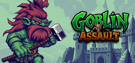
Goblin Assault: Tower Defense scores 77/100 — better than 77% of Early Access capsules (n=3,067).

Quick text summary

Goblin Assault: Tower Defense scored 77/100 on Steam Analyzer — Good for a Early Access capsule. Top priority fix: [title_readability] Increase ASSAULT subtitle size and weight to match or nearly match GOBLIN line to improve visual hierarchy and tiny-size legibility

Capsule scores by dimension

  • Genre Clarity: 8/10 — Clear tower defense strategy signal. The goblin character with aggressive pose and visible tower structure in background immediately communicate strategy and action gameplay. At tiny size, the iconic green goblin silhouette and castle fortress remain legible, clearly signaling tower defense mechanics without ambiguity.
  • Title Readability: 8/10 — Strong readable title with good contrast. GOBLIN ASSAULT in bright lime green with orange ASSAULT subtitle sits on a clean background region with minimal texture interference. The title maintains readability even at tiny size due to high saturation and outline treatment, though ASSAULT in orange is slightly smaller and risks slight blur at thumbnail scale.
  • Contrast & Color: 8/10 — Excellent value separation and silhouette. The vibrant magenta and green goblin pops distinctly against the pale mint background and dark Steam overlay. Strong saturation and clear light-to-dark transitions create clean silhouettes that survive squint and grayscale tests, with the character reading as a solid focal point at all sizes.
  • Uniqueness & Polish: 7/10 — Polished indie aesthetic with personality. The hand-drawn goblin character with exaggerated features and visible hammer convey charm and intentional art direction rather than generic asset assembly. The color palette and character pose feel distinctive within indie strategy space, though the overall composition still follows familiar tower defense visual tropes.
  • Brand Consistency: 7/10 — Coherent goblin-centric brand identity. The distinctive magenta goblin with tribal markings and aggressive stance create a recognizable character motif that could anchor future marketing. The emerald and magenta palette feels consistent and memorable, though without additional reference materials, internal signals suggest a focused but not yet iconic identity.
  • Composition: 8/10 — Clear focal point with strong hierarchy. The goblin character dominates center-left with the castle fortress providing secondary context on right, creating natural depth and visual flow. Safe margins protect title and character from edge cropping, and the layout maintains clear primary subject focus even at tiny size with no competing elements.

What works

  • Vibrant color palette pops on dark backgrounds. Magenta and lime green create excellent value separation and saturation that makes the capsule immediately visible in Steam browsing despite competitive thumbnails.
  • Character-driven visual storytelling. The aggressive goblin pose with hammer and tower backdrop instantly communicate both the protagonist and the core tower defense mechanic without text reliance.
  • Clean title placement and legibility. Bright green and orange text with outline treatment remain readable at all sizes and sit on a protected background zone without texture interference.

What hurts the capsule

  • Orange subtitle smaller and slightly less legible. ASSAULT in smaller orange point size risks blur and loses emphasis at tiny thumbnail size, competing with the primary title weight.
  • Moderate generic tower defense framing. While well-executed, the goblin protagonist against castle backdrop follows familiar indie strategy visual conventions without a standout unique hook that distinguishes from peers like Balatro or Manor Lords.
  • Limited supporting visual context. Beyond the character and fortress, there are few environmental details or mechanical hints that communicate what differentiates Goblin Assault from other tower defense entries.

Priority fixes

  1. [title_readability] Increase ASSAULT subtitle size and weight to match or nearly match GOBLIN line to improve visual hierarchy and tiny-size legibility
  2. [uniqueness_polish] Add a distinctive visual element (mechanic indicator, signature effect, or motif) that signals what makes this tower defense unique compared to genre peers
  3. [composition] Consider adding subtle gameplay hints in background (resource icons, special units, or defensive structures) to strengthen mechanical clarity without cluttering focus

Store copy priority fixes

  1. [uniqueness] Add 1-2 sentences explaining what makes Goblin Assault's tower defense mechanics or progression system different (e.g., 'Choose between 5 unique tower types with branching upgrades' or 'Each boss demands a new strategy').
  2. [feature_communication] Replace 'Key Features' section with a bulleted list of 4-5 specific, concrete mechanics (e.g., '5 tower types with distinct abilities,' 'Dynamic spell system with 8+ spells to unlock,' 'Boss encounters with unique attack patterns').
  3. [hook_strength] Rewrite the short description to lead with a specific, concrete hook instead of generic superlatives (e.g., 'Command towers and summon allies to survive 30 waves of escalating goblin assaults' or 'Every tower upgrade and spell choice matters—one wrong move and the goblins breach your defenses').
  4. [audience_targeting] Add 1-2 sentences explicitly addressing difficulty (e.g., 'Designed for players seeking a challenging strategy experience' or 'Easy to learn, punishing on higher difficulties') to match the 'Difficult' tag.

Related guides

Steam app ID: 3301160 · Tags: Early Access, Strategy, Tower Defense, Singleplayer, 2D