Scoring genre clarity...
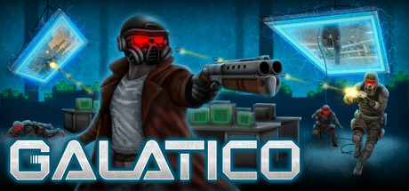
Blast your way to the top of GALATICO, a high-tempo movement shooter inspired by the best shooters of the 90s. Dismantle the gatekeepers of the universe's most powerful technology: Portals. Clock-in… it's time to trim the fat from GALATICO.
$7.99Positive(13)
Early AccessBoomer ShooterArena Shooter
Galatico StudiosNov 18, 2025