Scoring genre clarity...
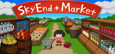
This is a game to manage a supermarket. Set up shelves, arrange products, and make your store bigger and bigger! Sell your goods to the remaining people, animals, and robots in the last place on earth just before the human race is exterminated.
$18.99Very Positive(163)
SimulationSandboxManagement
AndymenteFeb 27, 2025