Scoring genre clarity...
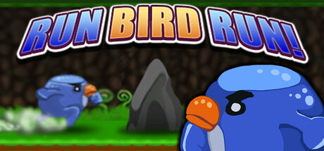
Run! And Jump. Run Bird Run! is an infinite runner where you play as a bird, jumping over rocks. The game is designed to be more relaxing than intense. After jumping over a few rocks and finding your rhythm, you might just enter the flow state.
Free to PlayMixed(32)
ActionCasualArcade
VaragtPMar 10, 2025