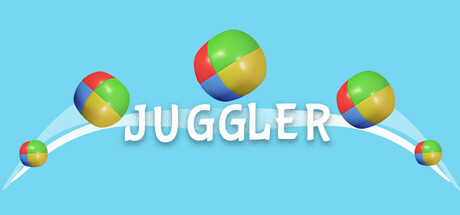
Juggler scores 87/100 — better than 98% of Casual capsules (n=10,153).

Quick text summary

Juggler scored 87/100 on Steam Analyzer — Excellent for a Casual capsule. Top priority fix: [uniqueness_polish] Consider adding subtle environmental or challenge context (e.g., a stage background, obstacle hints, or progression visual) to communicate the 'hardest thing in the world' difficulty claim without cluttering the core design.

Capsule scores by dimension

  • Genre Clarity: 9/10 — Crystal clear casual mechanics. The colorful juggling balls with their rainbow gradient segmentation immediately communicate the core mechanic—juggling. The trajectory lines and three balls in mid-arc pose leave no ambiguity about the gameplay loop. At tiny size, the silhouette of the balls and motion lines still clearly convey 'juggling game' without confusion.
  • Title Readability: 9/10 — Excellent bold legibility. The word 'JUGGLER' is rendered in large, clean white sans-serif with a subtle shadow that ensures strong contrast against the light blue background. The text remains fully readable at small and tiny sizes, and the placement across the center horizontal axis keeps it in the visual hierarchy without competing with the primary subject.
  • Contrast & Color: 9/10 — Strong value separation throughout. The light cyan background (#87CEEB range) creates excellent contrast with both the white title text and the saturated rainbow balls. The gradient balls use warm (red, yellow, orange) and cool (blue, green) hues that maintain silhouette clarity and pop distinctly against the cool background. Even in grayscale, the value separation remains clean and legible at all sizes.
  • Uniqueness & Polish: 8/10 — Polished with iconic visual hook. The rainbow-gradient juggling balls are a distinctive visual signature that feels premium and intentional, not templated. The smooth 3D rendering of the spheres, the graceful arc trajectory, and the cohesive color treatment elevate this beyond generic casual game fare. The design communicates playfulness and skill simultaneously, though it doesn't push into a completely unique art direction compared to peers.
  • Brand Consistency: 8/10 — Cohesive identity with memorable motif. The rainbow gradient ball is a strong iconic motif that would be recognizable across marketing materials and screenshots. The clean, friendly aesthetic with light blue background and white typography creates a consistent, approachable brand identity. The simplicity ensures the ball design can anchor future promotional materials without feeling disjointed.
  • Composition: 9/10 — Perfect hierarchy and focal balance. The three juggling balls create a clear visual pyramid with the largest ball centered at the top, guiding the eye naturally. The curved trajectory lines lead the viewer's attention in a flowing motion that reinforces the mechanic. Title placement below the action zone respects safe margins, and the composition remains dynamically readable at small and tiny sizes without cropping losses.

What works

  • Genre immediately obvious. The juggling balls, trajectory arcs, and posed action communicate the core mechanic at a glance, even at thumbnail size.
  • Title reads perfectly at all sizes. Clean white sans-serif with strategic shadow ensures 'JUGGLER' remains legible from full header down to tiny thumbnail without degradation.
  • Distinctive visual identity. The rainbow gradient balls are a memorable, recognizable motif that stands out as the game's signature element rather than generic casual iconography.
  • Excellent contrast and silhouette. Strong value separation between light background and colored elements ensures the design pops against Steam's dark interface and maintains clarity in grayscale.

What hurts the capsule

  • Limited visual complexity. The capsule is quite minimal—while this aids readability, it offers little storytelling depth or hint of challenge progression that could appeal to skill-focused players.
  • Generic calm aesthetic. The light blue sky background and pastel treatment feel somewhat generic and don't hint at the difficulty or challenge aspect mentioned in the description.

Priority fixes

  1. [uniqueness_polish] Consider adding subtle environmental or challenge context (e.g., a stage background, obstacle hints, or progression visual) to communicate the 'hardest thing in the world' difficulty claim without cluttering the core design.
  2. [genre_clarity] Add a faint juggler silhouette or hand element in the background to reinforce the human skill aspect and create additional visual interest without compromising readability.

Store copy priority fixes

  1. [uniqueness] Replace 'juggle the hardest thing in the world' with a specific, concrete example of the final challenge or unique mechanic that sets this game apart from other arcade games.
  2. [feature_communication] Add concrete examples of ball types and power effects (e.g., 'unlock flaming balls that increase combo multipliers, or slow-motion powers to freeze time') so players understand gameplay depth.
  3. [audience_targeting] Add a brief difficulty or skill-level indicator to clarify whether the game is a casual fun experience, a skill-demanding challenge, or both—and for whom it is best suited.

Related guides

Steam app ID: 3312720 · Tags: Casual, Score Attack, Arcade, 3D, Controller