Scoring genre clarity...
Scoring genre clarity...
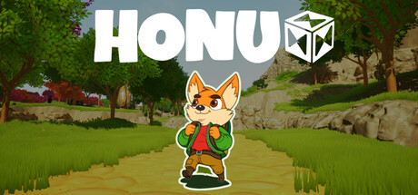
Honu scores 75/100 — better than 73% of Exploration capsules (n=5,215).
Positive (27 reviews) · Free to Play · Released Nov 11, 2025 · By H-BRS GameDev
Honu scored 75/100 on Steam Analyzer — Good for a Exploration capsule. Top priority fix: [genre_clarity] Introduce a visual puzzle or magitech element (e.g., glowing rune, geometric magic effect, or reshaped world hint) to communicate the core mechanic and differentiate from generic casual adventure.
Steam app ID: 3318830 · Tags: Exploration, Puzzle, Casual, 3D, First-Person