Scoring genre clarity...

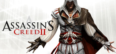
Assassin's Creed 2 capsule

Assassin's Creed 2

An epic story of family, vengeance and conspiracy set in the pristine, yet brutal, backdrop of a Renaissance Italy. New low price!

$19.99Very Positive(582)
ActionOpen WorldAssassins
Ubisoft MontrealMar 9, 2010

Assassin's Creed 2 scores 88/100 — better than 99% of Action capsules (n=10,329).

Very Positive (582 reviews) · $19.99 · Released Mar 9, 2010 · By Ubisoft Montreal

Quick text summary

Assassin's Creed 2 scored 88/100 on Steam Analyzer — Excellent for a Action capsule. Top priority fix: [composition] Consider subtle background detail or texture (Renaissance architecture, Italian setting cue) to add visual depth without reducing contrast or cluttering the focal point.

Capsule scores by dimension

  • Genre Clarity: 9/10 — Iconic assassin clearly signals action-adventure. The hooded protagonist in period armor with visible weapons and aggressive stance immediately communicates stealth-action gameplay. At tiny size, the distinctive white hood and dark silhouette remain recognizable as the Assassin's Creed franchise signature, and the Renaissance setting with combat-ready pose reinforces action-adventure genre expectations.
  • Title Readability: 9/10 — Bold serif title with excellent contrast hierarchy. The large 'ASSASSIN'S CREED II' text in strong black serif font with red 'CREED' accent reads cleanly at all sizes against the light background. The 'DELUXE EDITION' subtitle and 'AVAILABLE NOW ON THE MAC' header are all legible at small size, with strategic contrast preventing collapse at tiny viewing.
  • Contrast & Color: 9/10 — Strong light-dark separation with warm accents. The light gray-white background creates excellent separation from the dark-hooded protagonist and his burgundy-brown armor, which pop distinctly against Steam's dark theme. At tiny size, the silhouette remains clear with no muddy mid-tones, and the red text accent provides additional visual pop that guides attention without causing clutter.
  • Uniqueness & Polish: 8/10 — Recognizable character with premium historical polish. The Ezio character design is distinctive and immediately recognizable as the face of Assassin's Creed II, rendered with detailed period-accurate armor and cape that convey production quality. The composition avoids generic action-game tropes by centering the specific protagonist rather than abstract violence, though the layout is relatively traditional for AAA action games.
  • Brand Consistency: 10/10 — Iconic Assassin's Creed visual identity locked in. The white hood, hidden blade stance, Renaissance period aesthetic, and red-black color palette are unmistakable Assassin's Creed hallmarks visible across all sizes. The logo treatment and character design maintain franchise consistency with no visual confusion, establishing strong recall potential for returning players.
  • Composition: 8/10 — Clear focal point with balanced text placement. The hooded protagonist occupies the right-center zone as the dominant focal point, while the title stack anchors the left-center with the platform banner at top creating a natural hierarchy. At small and tiny sizes, the character remains the primary subject without competing elements, though the platform tagline at top creates slight visual tension but does not harm readability.

What works

  • Iconic character immediately recognizable. Ezio's distinctive white hood and assassin silhouette communicate both franchise and genre at any viewing size.
  • Excellent contrast against dark Steam background. Light background and dark subject create strong separation that prevents any blending or loss of silhouette clarity.
  • Readable title hierarchy at all scales. Bold serif typography with red accent maintains legibility from full header down to tiny thumbnail without losing meaning.
  • Premium production quality evident. Detailed armor rendering and period-accurate costume design signal AAA production value and historical authenticity.

What hurts the capsule

  • Tagline competes for top attention space. The 'AVAILABLE NOW ON THE MAC' banner creates visual noise at the top that slightly dilutes focus on the core brand.
  • Background texture somewhat flat. The light gray-white background lacks visual interest and could benefit from subtle historical or environmental context to enhance the setting.

Priority fixes

  1. [composition] Consider subtle background detail or texture (Renaissance architecture, Italian setting cue) to add visual depth without reducing contrast or cluttering the focal point.
  2. [contrast_color] Ensure platform tagline has slightly reduced opacity or weight to prevent it competing with title hierarchy at small sizes.

Store copy priority fixes

  1. [uniqueness] Replace 'features new experiences that will surprise and challenge players' with a concrete list of new mechanics (e.g., 'adds swimming and aerial assassination routes to free-running') to clarify differentiation from the original.
  2. [hook_strength] Lead the short description with an action verb or player agency frame (e.g., 'Become a master assassin and hunt down those who betrayed your family in Renaissance Italy') to shift from passive premise to active player role.
  3. [audience_targeting] Add a single sentence clarifying the balance of stealth, combat, and exploration (e.g., 'Play as a silent infiltrator or an open combatant—the choice is yours') to help stealth-vs-action players self-select.
  4. [genre_clarity] Move or echo the 'free-running', 'open-ended', and 'assassinate' language into the short description to immediately signal action-adventure gameplay to Steam store browsers.

Related guides

Steam app ID: 33230 · Tags: Action, Open World, Assassins, Parkour, Stealth