Scoring genre clarity...

EVERDARK: Undead Apocalypse capsule

EVERDARK: Undead Apocalypse

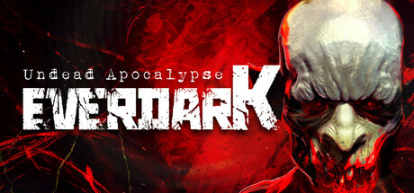
Inspired by horror and B-movies from the '80s, Everdark takes us to a city infested with vampires. Armed with stakes, garlic, crosses, holy water, and an arsenal of firearms and melee weapons, we'll fight our way through this shooter that blends classic survival horror with an oppressive atmosphere.

$9.343 user reviews
FPSSurvival HorrorAction-Adventure
ESDIP_GAMES, Everdark LabsOct 23, 2025

EVERDARK: Undead Apocalypse scores 70/100 — better than 35% of FPS capsules (n=1,272).

3 user reviews · $9.34 · Released Oct 23, 2025 · By ESDIP_GAMES

Quick text summary

EVERDARK: Undead Apocalypse scored 70/100 on Steam Analyzer — Good for a FPS capsule. Top priority fix: [uniqueness_polish] Add a visual element that signals vampire-specific mechanics—such as a silhouetted figure holding a stake or cross, or a stylized '80s B-movie title treatment—to distinguish this from generic undead horror.

Capsule scores by dimension

  • Genre Clarity: 8/10 — Horror action shooter clearly signaled. The skull with red glowing eye sockets, blood-red atmospheric background, and aggressive typography immediately convey horror-action gameplay. At tiny size, the skull silhouette and red color palette remain unmistakably horror-focused, though the specific vampire/undead subgenre requires the text to fully register. The '80s B-movie aesthetic is communicated through visual tone rather than explicit iconography.
  • Title Readability: 7/10 — Title readable at all sizes with minor tagline loss. EVERDARK in bold white capitals maintains strong legibility from full size down to tiny, with clear letterforms and solid contrast against the red background. The smaller 'Undead Apocalypse' tagline becomes unreadable at tiny size, but the primary title survives intact. At small size both elements read clearly, making this a functional but not exceptional approach to title hierarchy.
  • Contrast & Color: 8/10 — Strong red-and-white value separation. The grayscale mental test shows excellent value separation between the pale skull (light), glowing eyes (bright red), and dark red/black background (dark). The white title text pops decisively against warm red, and the silhouette clarity remains sharp even when squinting. The red saturation is intentional and supports the horror tone without muddy mid-tones that would collapse at tiny size.
  • Uniqueness & Polish: 6/10 — Competent horror theme without standout hook. The skull-and-blood visual is well-executed but follows familiar horror capsule templates seen across many survival horror titles. The craftsmanship is clean—the gradient, particle effects, and skull rendering are polished—but the design does not communicate a unique selling point like vampire-specific mechanics or the '80s B-movie inspiration that differentiates it. It reads as a premium take on a common subgenre trope rather than a distinctive identity.
  • Brand Consistency: 6/10 — Generic horror aesthetic without memorable identity. The red skull and atmospheric blood effects are cohesive internally, but they lack iconic imagery that would make this recognizable as EVERDARK specifically rather than any undead-themed game. There is no character, motif, symbol, or signature palette element that signals a distinct brand. Against reference titles like DREDGE (which has a unique artistic style) or Senua's Saga (with recognizable character design), this remains visually generic within the horror category.
  • Composition: 7/10 — Clear focal point with functional but safe layout. The skull centered as the primary focal point is strong and holds attention from full size through tiny size; the title placement in the upper left is clean and does not interfere with the skull. The layering of title text, skull, and atmospheric red creates depth. However, the composition is symmetrical and predictable—the skull does not suggest active gameplay or narrative stakes, and the design leans on static atmosphere rather than dynamic visual storytelling that would distinguish it from peers.

What works

  • Excellent skull silhouette clarity. The pale skull with glowing red eyes maintains sharp definition and recognizability at all viewing sizes, including tiny thumbnails, and reads instantly as horror-action.
  • Strong title-background contrast. White EVERDARK text on red background achieves excellent value separation and remains legible at small size without outline assistance.
  • Cohesive red-and-black palette. The warm red gradient and dark background work together without muddy mid-tones, supporting both mood and contrast at every scale.

What hurts the capsule

  • Tagline becomes unreadable at tiny size. 'Undead Apocalypse' text is too small to parse at thumbnail size, leaving only the title to communicate the game identity.
  • Generic horror template without unique hook. Skull and blood effects are well-crafted but closely follow industry-standard survival horror design language, offering no visual differentiation from similarly themed titles.
  • No gameplay mechanic communication. The capsule shows atmosphere and tone but does not visually hint at the vampire-slaying mechanics, firearms, or B-movie inspiration that differentiate Everdark from other undead shooters.
  • Static composition lacks dynamic energy. The centered skull and symmetrical layout are safe but do not convey action, player agency, or the kinetic gameplay loop that would set it apart in quick scroll.

Priority fixes

  1. [uniqueness_polish] Add a visual element that signals vampire-specific mechanics—such as a silhouetted figure holding a stake or cross, or a stylized '80s B-movie title treatment—to distinguish this from generic undead horror.
  2. [brand_consistency] Introduce an iconic symbol or character motif (e.g., a recognizable protagonist or signature weapon) that could become a memorable brand cue across future marketing.
  3. [composition] Rebalance the layout to suggest action or narrative stakes—consider asymmetrical positioning of the skull or the addition of a foreground element (weapon, figure) that creates visual depth and gameplay implication.
  4. [title_readability] Increase the size or weight of the 'Undead Apocalypse' tagline so it remains readable at small capsule size without sacrificing the primary title.

Store copy priority fixes

  1. [uniqueness] Add a sentence explaining what the vampire-slaying mechanics or level design specifically do differently from existing FPS-horror hybrids—e.g., 'the only FPS where vampires require a two-stage kill system' or highlight a specific mechanic or aesthetic choice that sets it apart.
  2. [audience_targeting] Clarify difficulty or player skill expectation in one sentence—e.g., 'designed for hardcore FPS fans seeking a survival horror challenge' or 'accessible to action-adventure players new to the genre.'
  3. [feature_communication] Add estimated playtime or chapter breakdown to ground the 'first chapter' promise—e.g., '4-6 hours of content across 15 levels' to manage expectations around scope.
  4. [hook_strength] Strengthen the short description's opening by leading with a specific hook phrase like 'A '80s vampire apocalypse shooter where stakes are your deadliest weapon' to compete harder on crowded store pages.

Related guides

Steam app ID: 3324980 · Tags: FPS, Survival Horror, Action-Adventure, Action, Adventure