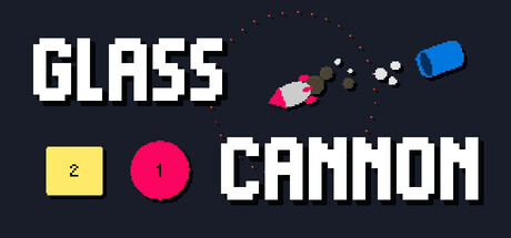
Glass Cannon scores 72/100 — better than 43% of Arena Shooter capsules (n=556).

Quick text summary

Glass Cannon scored 72/100 on Steam Analyzer — Good for a Arena Shooter capsule. Top priority fix: [genre_clarity] Replace or contextualize geometric shapes with weapon or mod-themed iconography that visually hints at the synergy/combo mechanic core to gameplay.

Capsule scores by dimension

  • Genre Clarity: 7/10 — Roguelike action shooter clearly implied. The capsule communicates a casual action game through pixel art style, colorful geometric shapes (yellow square, pink circle, blue cannon), and a small rocket sprite with trajectory dots suggesting aiming mechanics. At tiny size the cannon and projectile elements remain readable enough to signal 'action puzzle' gameplay, though 'roguelike' synergy depth is not visually apparent from iconography alone.
  • Title Readability: 8/10 — Bold pixel font reads well at all sizes. Both 'GLASS' and 'CANNON' use a clean, high-contrast white pixel typeface positioned on the dark background with clear separation. The title remains fully legible at small and tiny sizes due to thick letterforms and generous spacing. No decorative flourishes or small taglines compromise readability at any viewing distance.
  • Contrast & Color: 8/10 — Strong value separation and pop. White text and bright geometric shapes (hot pink circle, yellow square, blue cannon) stand out sharply against the dark navy background (#1b2838-adjacent). The silhouettes read clearly in grayscale, with vibrant saturation adding visual punch. Small ornamental dots and rocket sprite maintain crisp edges and don't muddy the design at small scales.
  • Uniqueness & Polish: 7/10 — Polished pixel aesthetic, modest differentiation. The capsule demonstrates clean craft with intentional color choices and a cohesive retro pixel art style that aligns with casual roguelike expectations. However, the design relies on generic geometric shapes and abstract imagery rather than communicating the unique 'weapon synergy' or 'creative elimination' mechanics mentioned in the description, making it feel competent but not visually distinctive from similar genre entries.
  • Brand Consistency: 6/10 — Consistent style, minimal iconic identity. The pixel art palette and geometric shape language appear intentional and internally cohesive, with no rendering conflicts or style breaks. However, there are no memorable character, symbol, or signature visual motifs that would create strong brand recognition across multiple touchpoints; the design reads more as a competent stylistic choice than a distinctive brand voice.
  • Composition: 7/10 — Clear hierarchy, well-balanced layout. The title anchors the left and center with strong weight, while gameplay elements (shapes, cannon, projectiles) are distributed across the right side and lower area, creating natural visual flow without clutter. At tiny size the layout remains balanced with 'GLASS CANNON' clearly focal. Spacing is generous and safe margins are respected, though the scattered dot particles could feel slightly ornamental rather than purposeful.

What works

  • Excellent title legibility. Bold pixel typeface with high contrast and generous spacing ensures 'GLASS CANNON' remains fully readable at all sizes down to tiny thumbnail.
  • Strong color pop and contrast. Vibrant hot pink, yellow, and blue geometric elements combined with white text create vivid silhouettes that stand out sharply against dark background.
  • Clean, intentional craft. Cohesive pixel art style and symmetric balance demonstrate polish without appearing cluttered or amateurish.

What hurts the capsule

  • Gameplay mechanics not visually communicated. Abstract geometric shapes and generic imagery do not clearly convey 'roguelike synergy,' 'weapon mods,' or 'creative elimination' that differentiate the game from similar titles.
  • Limited brand identity signals. No iconic character, repeated motif, or signature visual element that would be recognizable as Glass Cannon across multiple store assets or marketing materials.
  • Ornamental particles lack purpose. Small dots scattered across the upper right feel decorative and don't clearly reinforce genre or gameplay, adding minor visual noise without strategic value.

Priority fixes

  1. [genre_clarity] Replace or contextualize geometric shapes with weapon or mod-themed iconography that visually hints at the synergy/combo mechanic core to gameplay.
  2. [uniqueness_polish] Introduce a recognizable character, mascot, or signature visual symbol (e.g., a stylized 'Glass' aesthetic or recurring icon) to establish memorable brand identity across storefronts.
  3. [composition] Reduce decorative dot particles and replace with purposeful visual elements (e.g., synergy connection lines, mod upgrade indicators) that communicate strategic depth at a glance.

Store copy priority fixes

  1. [hook_strength] Replace 'Challenging and chill' in the short description with a verb-forward hook like 'Plan each shot carefully to build devastating weapon synergies and clear 24 rounds' to lead with gameplay rather than contradictory adjectives.
  2. [feature_communication] Add one sentence to the detailed description explaining the progression model: 'Between rounds, you spend earned money to buy and mod new weapons, building synergies that carry through the entire run.'
  3. [uniqueness] Clarify the physics-based mechanic by adding: 'Each bullet has limited bounces—master ricochet angles to hit multiple enemies with a single shot, turning the arena into a puzzle.'
  4. [feature_communication] Rewrite the enemy damage rule for clarity: 'Enemies you don't eliminate each round attack you, dealing damage equal to their remaining health—forcing strategic prioritization.'

Related guides

Steam app ID: 3325030 · Tags: Arena Shooter, Physics, Roguelike Deckbuilder, Procedural Generation, Inventory Management