Scoring genre clarity...

Kaodi capsule

Kaodi

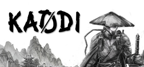
Guide war veteran Barren home through the devastated kingdom of Kaodi. Collect concepts and items whose meanings evolve as you interact with the world, uncovering new perspectives on war's impact in this brief 2D narrative experience.

$4.99Positive(18)
AdventureNinjaDialogue Heavy
Outlander GamesJun 3, 2025

Kaodi scores 68/100 — better than 22% of Adventure capsules (n=7,922).

Positive (18 reviews) · $4.99 · Released Jun 3, 2025 · By Outlander Games

Quick text summary

Kaodi scored 68/100 on Steam Analyzer — Solid for a Adventure capsule. Top priority fix: [uniqueness_polish] Introduce a subtle signature visual element—such as a unique artifact glow or symbolic object—that hints at the 'evolving concepts' mechanic and creates immediate differentiation from generic action-adventure capsules.

Capsule scores by dimension

  • Genre Clarity: 7/10 — Clear action-adventure with Eastern setting. The conical Asian hat, mountainous landscape, and veteran character silhouette signal action-adventure in an Eastern (likely Japanese-inspired) setting. At tiny size the character and architecture remain readable, though the narrative indie focus is not immediately obvious from visuals alone. The genre reads as action-adventure cleanly, but the game's deeper narrative indie angle is not communicated by the capsule.
  • Title Readability: 8/10 — Bold title with good size hierarchy. KAODI is rendered in large, thick black letterforms with clean spacing positioned in the upper left against white/light background, making it highly readable at all sizes including tiny. The title maintains legibility even at 120x45 due to generous sizing and strong value contrast. No tagline or supporting text clutters the design.
  • Contrast & Color: 7/10 — Strong black-to-white value separation. The monochromatic grayscale palette creates excellent contrast between the character, title, and background sky against the dark Steam background #1b2838. Black title and character silhouettes pop clearly at small size, though the mid-tone mountains in the background lack visual punch. Grayscale rendering ensures readable silhouettes even at tiny scale.
  • Uniqueness & Polish: 6/10 — Competent but visually generic presentation. The hand-drawn sketch aesthetic on the character and architecture shows craft, but the overall composition—veteran in Eastern setting with landscape—follows familiar action-adventure template conventions. The capsule communicates setting and tone competently but lacks a distinctive visual hook or memorable unique selling point that differentiates it from comparable indie action titles. No mechanical or narrative hint visible to convey the 'evolving concepts' core mechanic.
  • Brand Consistency: 6/10 — Minimal but coherent visual identity. The monochromatic sketch style is internally consistent, and the conical hat becomes a recognizable motif. However, without exposure to the 7 available screenshots, the visual language feels like a functional choice rather than a distinctive branded identity that would be immediately recognizable as 'Kaodi' on a store shelf. The palette and style could apply to several similar titles.
  • Composition: 7/10 — Well-balanced layout with clear focal points. Title anchors the upper left, character commands right-center focus, and mountains provide grounding background depth. The composition avoids clutter and maintains safe margins from edges at multiple scales. At tiny size, the character remains the primary focal point while the title stays readable; however, the design is somewhat static and symmetrical rather than dynamic or layered.

What works

  • Title legibility across sizes. KAODI's thick black letterforms remain clearly readable even at 120x45 thumbnail scale due to ample sizing and white background placement.
  • Silhouette clarity and contrast. The grayscale monochromatic rendering creates strong edge separation between character, title, and background, maintaining visual clarity against the dark Steam background.
  • Internal visual consistency. Sketch-style rendering is applied cohesively to character, environment, and typography, creating a unified aesthetic without jarring tonal shifts.

What hurts the capsule

  • Generic template composition. The veteran-in-Eastern-landscape setup mirrors many action-adventure indie titles, lacking a distinctive visual hook or memorable standout element.
  • Narrative identity not communicated. The capsule does not visually hint at the game's unique core mechanic of 'concepts with evolving meanings' or its narrative-driven indie angle—it reads as straightforward action-adventure.
  • Limited color palette impact. Pure monochromatic grayscale, while readable, lacks warmth or visual personality that would help the capsule stand out in a scrolling store browser among more saturated competing titles.

Priority fixes

  1. [uniqueness_polish] Introduce a subtle signature visual element—such as a unique artifact glow or symbolic object—that hints at the 'evolving concepts' mechanic and creates immediate differentiation from generic action-adventure capsules.
  2. [contrast_color] Add a strategic accent color (warm gold or muted teal) to the character's hat or environment to increase visual warmth and memorability while maintaining the sketch aesthetic.
  3. [genre_clarity] Consider a minimal UI or concept element (sketched object, aura, or symbolic mark) that signals the narrative indie angle beyond pure action-adventure, visible at small size.

Store copy priority fixes

  1. [feature_communication] In the detailed description, add a dedicated paragraph explaining the 'collecting concepts' mechanic: what does Barren collect, how do meanings change, and what does the player do with these collected items to advance?
  2. [genre_clarity] Move combat and platforming detail earlier and clarify the balance: rewrite the final paragraph to read something like 'Combat and platforming complement Barren's journey—engage in duels and navigate hazards while uncovering the story's deeper truths,' to signal integrated gameplay rather than an afterthought.
  3. [uniqueness] Add a sentence explaining what makes this narrative experience distinct—for example, emphasize how the Inner World introspection interacts with the platformer/action elements in a way other games do not.

Related guides

Steam app ID: 3325570 · Tags: Adventure, Ninja, Dialogue Heavy, Side Scroller, Choose Your Own Adventure