Scoring genre clarity...
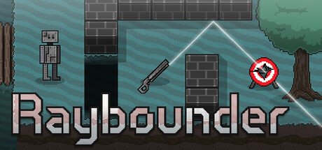
A unique top-down puzzle shooter where you control a robot with an unusual weapon. Throw your laser gun across gaps, hit switches, and fire the gun to shoot beams that ricochet off walls, destroy enemies, and hit targets. Make every shot count as you solve puzzles in 60+ stages!
$4.991 user reviews
Sci-fiPuzzleFuturistic
zilardSep 10, 2025