Hallway Shot scores 65/100 — better than 11% of Singleplayer capsules (n=16,133).

Quick text summary

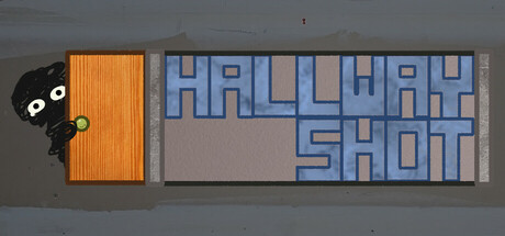
Hallway Shot scored 65/100 on Steam Analyzer — Solid for a Singleplayer capsule. Top priority fix: [title_readability] Reposition title to upper-left or center safe zone with stronger outline or shadow to preserve legibility below 150px width.

Capsule scores by dimension

  • Genre Clarity: 7/10 — Horror setup clear, character iconic. The cartoonish black creature peeking from behind an orange door immediately signals horror-comedy or indie horror, while the institutional hallway setting reinforces confined survival dread. At tiny size, the character silhouette and door contrast remain readable, though genre subtype (survival loop) is not explicit from visuals alone.
  • Title Readability: 6/10 — Readable at full, fragile at tiny. Title uses clean sans-serif in light blue on a neutral gray background with adequate spacing and letterform clarity at full size. At small and tiny sizes, the all-caps geometric typography remains technically readable but loses impact and begins to feel cramped; tagline positioning on the right edge risks Steam crop issues.
  • Contrast & Color: 7/10 — Strong figure-ground separation. The orange door and black creature create a clear, high-contrast focal point against the neutral gray hallway and dark background. The light blue title type stands apart from both the gray mid-tone and dark edges, though at tiny sizes the saturation and value separation remain functional without feeling premium.
  • Uniqueness & Polish: 6/10 — Charming but genre-typical design. The cute-creepy character design and retro-minimalist hallway aesthetic feel intentional and cohesive, avoiding obvious templating. However, the overall composition—creature reveal, institutional setting, bold primary shapes—follows familiar indie horror tropes and lacks a distinctive visual hook that would elevate it above competent baseline.
  • Brand Consistency: 6/10 — Character design recognizable, palette consistent. The black creature with large white eyes is a clear, memorable mascot with internal visual consistency in linework and expression. The orange-gray-blue palette is controlled and would likely persist across marketing materials, though no unique visual signature or iconic symbol beyond the creature itself distinguishes this from similar titles.
  • Composition: 7/10 — Clear hierarchy, safe focal point. The creature-and-door occupy strong left-third composition with clear visual weight, while the title sits right with breathing room and avoids clutter. The depth layering (character forward, door mid, hallway back) reads instantly at small sizes, though the title placement slightly competes with the creature at tiny scales and the right edge risks Steam's standard crop.

What works

  • Memorable character mascot. The black creature with large white eyes is immediately recognizable and charming, creating a strong visual anchor that would be identifiable across multiple marketing surfaces.
  • Effective spatial depth. The layering of creature, door, and hallway background creates readable foreground-to-background separation that maintains clarity even at small capsule sizes.
  • Controlled color palette. The orange-gray-blue scheme is cohesive and avoids visual noise, allowing both figure and text to remain distinct on the Steam dark background.

What hurts the capsule

  • Generic indie horror composition. The peek-around-door setup and institutional hallway are well-executed but follow familiar survival horror visual language without a distinctive visual selling point.
  • Title fragility at tiny size. The geometric sans-serif typography, while clean, loses visual presence and hierarchy impact when scaled to 120×45 thumbnail, risking underscore in quick-scroll discovery.
  • Right-edge text crop risk. The title placement on the right half of the capsule sits dangerously close to Steam's typical image cropping zones on narrower displays.

Priority fixes

  1. [title_readability] Reposition title to upper-left or center safe zone with stronger outline or shadow to preserve legibility below 150px width.
  2. [uniqueness_polish] Add a visual twist or diegetic detail (UI element, asymmetry, particle effect) that communicates the 'looping' mechanic and differentiates from standard door-peek horror.
  3. [composition] Increase title font weight or letter spacing to strengthen hierarchy separation from the creature and background at small scales.

Store copy priority fixes

  1. [feature_communication] Add 2-3 concrete examples of puzzle types or enemy encounters (e.g., 'solve cipher locks while avoiding shadow creatures' or 'find hidden keys in randomly-placed furniture') to help players mentally simulate gameplay.
  2. [audience_targeting] Include a sentence specifying the intended player: 'Perfect for roguelite fans and horror enthusiasts who enjoy puzzle-solving over combat' or specify approximate playtime per run.
  3. [hook_strength] Strengthen the short description by adding a specific emotional or mechanical hook: change 'a looping hallway' to something like 'a looping hallway where puzzles are your only escape' to clarify the player agency.
  4. [uniqueness] Add a sentence that differentiates this from other roguelite horror games, such as what makes the hallway structure or alternative solutions mechanically or narratively distinct.

Related guides

Steam app ID: 3326600 · Tags: Singleplayer, Adventure, Survival Horror, Horror, First-Person