Scoring genre clarity...

Escape Camp Stranded capsule

Escape Camp Stranded

First person, single player horror game with puzzle elements. Solve the puzzles and explore to Escape Camp Stranded.

$0.991 user reviews
ExplorationPuzzleFirst-Person
attack_buttonApr 23, 2026

Escape Camp Stranded scores 62/100 — better than 3% of Exploration capsules (n=4,873).

1 user reviews · $0.99 · Released Apr 23, 2026 · By attack_button

Quick text summary

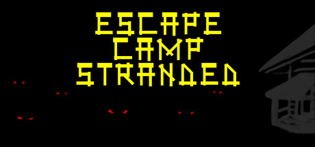
Escape Camp Stranded scored 62/100 on Steam Analyzer — Solid for a Exploration capsule. Top priority fix: [genre_clarity] Replace or enhance the building silhouette with a readable first-person POV environmental detail or iconic location that hints at the camp setting and exploration.

Capsule scores by dimension

  • Genre Clarity: 5/10 — Ambiguous horror setup lacks gameplay clarity. The yellow pixelated title and red dashes suggest danger or horror, but the visual language is too abstract to clearly signal first-person adventure or puzzle-solving at tiny size. The dark building silhouette on the right hints at exploration setting, but there are no UI elements, character interactions, or environmental details that confirm the puzzle or adventure genre expectations. At tiny size, this reads as generic horror rather than a specific adventure game.
  • Title Readability: 8/10 — Bold pixelated title reads clearly across sizes. The yellow all-caps pixelated font is legible at full size and maintains readability at small and tiny sizes due to high contrast against black background and thick letterforms. The stacked layout (ESCAPE / CAMP / STRANDED) is intentional and preserves hierarchy even when compressed. No decorative elements or taglines clutter the message, which is a strength for quick recognition.
  • Contrast & Color: 7/10 — Strong yellow-black separation with weak red accents. The bright yellow title pops decisively against the near-black background, creating excellent value separation that survives the Steam dark theme and grayscale testing. The small red dash accents (upper left and center area) add visual interest but are so small and low-contrast they contribute little at small sizes. Overall silhouette clarity is good, though the building outline on the right edge is nearly invisible at tiny size due to dark gray against black.
  • Uniqueness & Polish: 6/10 — Competent pixel aesthetic lacks distinctive hook. The pixelated title and minimal composition feel deliberately retro, which fits indie horror standards, but the treatment is generic within that space—many puzzle and horror games use identical pixel typography and dark backgrounds. The red dash accents attempt visual variation but feel decorative rather than thematic; there is no clear visual storytelling or mechanic communication that makes this feel like Escape Camp Stranded specifically rather than a template. Craft is clean but the visual hook is absent.
  • Brand Consistency: 5/10 — No memorable identity or visual signature established. The capsule contains no character, icon, or distinctive visual motif that would make Escape Camp Stranded recognizable in a lineup of similar titles. The pixel style and color palette (yellow, red, black) are generic to the pixel horror genre and do not reference any in-game assets or visual identity from the 15 available store screenshots. Without checking external reference, this could be any number of indie horror puzzlers; internal cohesion is present but brand signals are absent.
  • Composition: 6/10 — Centered title with unfocused supporting elements. The title occupies safe center space and reads clearly, but the red dashes scattered across the left and center feel random and create visual noise without guiding focus or supporting a clear focal point. The building silhouette on the right edge is compositionally weak—it sits in prime real estate but is too dark and low-contrast to read as a secondary focal point, making it feel like unused background. At tiny size, the composition flattens to just the yellow title; no layered depth or intentional hierarchy emerges. The overall effect is competent but lacking in dynamic balance or memorable structure.

What works

  • Title legibility across sizes. The bold yellow pixelated font maintains clear readability from full header down to tiny thumbnail due to thick strokes and high contrast.
  • Clean, uncluttered core message. No taglines or extra text compete with the main title, ensuring quick parsing during fast scroll.
  • Strong color pop against Steam dark background. Bright yellow creates decisive separation and visual appeal without relying on complex gradients or overlays.

What hurts the capsule

  • Vague decorative red dashes lack purpose. The scattered red marks feel random and detract from focus rather than reinforcing genre, mood, or gameplay hint.
  • Building silhouette is invisible at scale. The gray structure on the right edge blends into the black background and provides no readable environmental or thematic signal at small or tiny sizes.
  • Generic pixel horror aesthetic. The visual treatment has no distinctive character or thematic hook that differentiates this from dozens of other retro horror indie titles.
  • No gameplay or puzzle mechanic signaling. The capsule communicates vague danger but offers no visual clues about first-person exploration, puzzle-solving, or adventure gameplay.

Priority fixes

  1. [genre_clarity] Replace or enhance the building silhouette with a readable first-person POV environmental detail or iconic location that hints at the camp setting and exploration.
  2. [uniqueness_polish] Introduce a distinctive visual element from the game (character, key object, or landmark) to create brand memory and differentiate from generic pixel horror templates.
  3. [composition] Reorganize the red accents into a purposeful visual frame or accent pattern that either reinforces the title hierarchy or hints at danger/horror mood rather than appearing scattered.
  4. [brand_consistency] Reference specific in-game visual assets or color themes from the 15 screenshots to anchor the capsule in the game's actual aesthetic identity.

Store copy priority fixes

  1. [hook_strength] Rewrite the short description to lead with the nightmare premise: 'A childhood nightmare that haunted you returns. Escape Camp Stranded before the darkness consumes you again—if you can survive the night.' This replaces mechanical genre-listing with emotional stakes.
  2. [feature_communication] Restructure the opening of the detailed description to eliminate repetition and add concrete scope: Move the atmospheric paragraph up, then add one sentence clarifying estimated playtime and number of main puzzle challenges.
  3. [uniqueness] Explicitly differentiate the game by highlighting what makes the nightmare mechanic central to gameplay: 'The flashlight is your only defense, but in this dream, reality bends—what you find may not be what you need.' This ties atmosphere to mechanics.
  4. [tone_match] Rewrite the first paragraph to match the atmospheric tone of the second: Replace 'Your first task will be finding your flashlight because not only is it your visibility...' with more immersive language: 'Your flashlight is your lifeline—and your only weapon against the things moving through the dark.'

Related guides

Steam app ID: 3327820 · Tags: Exploration, Puzzle, First-Person, Horror, Adventure