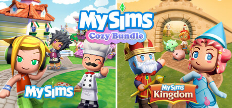
MySims™ Kingdom scores 65/100 — better than 7% of Character Customization capsules (n=1,619).

Quick text summary

MySims™ Kingdom scored 65/100 on Steam Analyzer — Solid for a Character Customization capsule. Top priority fix: [composition] Consolidate to a single dominant scene or character with one supporting element, removing the three-panel layout to establish clear focal hierarchy and improve small/tiny readability.

Capsule scores by dimension

  • Genre Clarity: 7/10 — Casual sim clear, whimsical tone evident. Bright, colorful characters and a pastoral setting with a house immediately signal a casual life simulation game rather than action or strategy. At tiny size, the distinctive cartoon character designs and cozy home environment remain readable and genre-appropriate. The whimsical art style clearly communicates family-friendly casual gameplay, though the specific 'Kingdom' hook is less obvious at smallest sizes.
  • Title Readability: 6/10 — Title readable at full and small, some tagline loss. The 'MySims' branding is clear and uses a recognizable blue logotype that maintains legibility down to small sizes. At tiny thumbnail size, the main title reads adequately but the 'Kingdom' text and 'Cozy Bundle' taglines become difficult to parse due to small point size and background noise. The logo placement across three game variants creates visual coherence but spreads attention.
  • Contrast & Color: 7/10 — Bright palette pops, some midtone softness. Vibrant character colors—yellows, pinks, blues, and oranges—contrast well against the light sky and grass backgrounds, which translates acceptably against Steam's dark background. At small size the characters remain visually distinct and colorful. However, some midtone blending occurs in the background elements (trees, buildings) and the overall bright pastel palette lacks the dramatic value separation seen in top-tier genre leaders like DREDGE or Tiny Glade.
  • Uniqueness & Polish: 6/10 — Competent but generic casual sim aesthetic. The capsule features clean character art and a cohesive cheerful color palette consistent with the MySims IP, but it reads as a straightforward game presentation without a strong unique hook or premium storytelling element that sets it apart. The composition feels like a 'meet the characters' lineup rather than showcasing a distinctive mechanic or memorable moment. Compared to genre leaders like Tiny Glade or Snufkin which use distinctive visual narratives, this capsule prioritizes character display over emotional engagement or standout art direction.
  • Brand Consistency: 7/10 — Strong MySims visual identity maintained. The character designs, proportions, and color palette are distinctly recognizable as MySims IP with consistent cartoon styling and signature character archetypes (the chef, the wizard, the explorer). Internal cohesion is strong—all elements feel like they belong to the same game world and brand family. However, the presentation is more of a straightforward lineup than a cohesive narrative moment that reinforces brand personality beyond aesthetic consistency.
  • Composition: 6/10 — Cluttered lineup lacks clear focal hierarchy. The composition stacks three separate game panels side-by-side, creating three competing focal points (one per variant) rather than a single strong primary subject. At small and tiny sizes, this fragmentation dilutes impact—viewers struggle to identify which character or element to focus on first. The layout is functional for showing bundle content but sacrifices compositional strength; a stronger capsule would feature one dominant scene or character with supporting elements, not three equal-weight panels.

What works

  • Bright character design clarity. Colorful, cartoon-styled characters with distinct silhouettes remain visually readable and appealing even at small sizes.
  • Consistent MySims branding. The art style, character proportions, and color palette strongly reinforce the MySims IP identity and feel cohesive across the variant panels.
  • Family-friendly genre communication. The whimsical setting, cheerful tone, and character designs immediately signal a casual, accessible simulation game appropriate for broad audiences.

What hurts the capsule

  • Competing focal points in three-panel layout. Three separate game variants create equal visual weight and scatter viewer attention rather than establishing a clear primary subject.
  • Tagline and secondary text illegible at tiny size. 'Cozy Bundle' and 'Kingdom' labels become unreadable at thumbnail dimensions, reducing communication clarity.
  • Generic 'character lineup' presentation. The capsule shows characters but lacks a distinctive moment, mechanic showcase, or emotional hook that differentiates it from typical casual sim marketing.
  • Midtone blending in background elements. Trees, buildings, and landscape details lack strong value separation from sky and grass, reducing overall contrast punch against dark backgrounds.

Priority fixes

  1. [composition] Consolidate to a single dominant scene or character with one supporting element, removing the three-panel layout to establish clear focal hierarchy and improve small/tiny readability.
  2. [title_readability] Enlarge and bold the main 'MySims Kingdom' title with increased contrast outline to maintain legibility down to tiny thumbnail size.
  3. [uniqueness_polish] Reframe the composition to showcase a distinctive gameplay moment or mechanic (building, decorating, exploration) rather than a static character lineup, differentiating from generic casual sim presentations.
  4. [contrast_color] Strengthen background silhouettes with darker, more saturated landscape elements or add a subtle vignette to increase separation between characters and background on dark Steam backgrounds.

Store copy priority fixes

  1. [hook_strength] Rewrite the short description to lead with a specific gameplay hook, e.g., 'Customize everything and build magical contraptions to restore a kingdom in this cozy adventure' rather than the generic 'Meet New Friends and explore all the New Lands.'
  2. [uniqueness] Add 1-2 sentences explaining what the 'updated graphics' refresh entails and why this rerelease is worth playing for franchise veterans and newcomers alike, not just that it is a retro re-release.
  3. [feature_communication] Expand each bulleted feature with a concrete example—e.g., under 'Building Options' mention a specific contraption type or puzzle you can solve, not just 'many more contraptions.'
  4. [audience_targeting] Include a sentence clarifying whether this game is designed for families playing together, solo casual players, nostalgia-driven adults, or a blend, to help the right audience identify itself.

Related guides

Steam app ID: 3328910 · Tags: Character Customization, Family Friendly, Adventure, Retro, Cute