Quick text summary
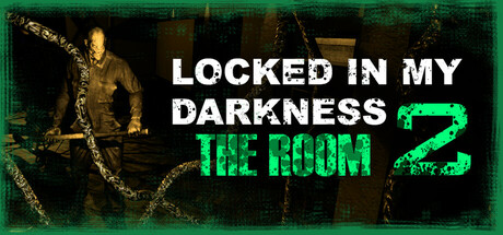
Locked in my Darkness 2: The Room scored 72/100 on Steam Analyzer — Good for a Simulation capsule. Top priority fix: [uniqueness_polish] Introduce a distinctive visual hook—such as a signature in-game mechanic visual (e.g., reality fracture effect, unique character silhouette, or symbolic prop) to differentiate from standard indie horror aesthetics.
Capsule scores by dimension
- Genre Clarity: 7/10 — Horror walking sim implied clearly. The golden skeletal figure in chains, dark industrial setting, and oppressive green neon title text immediately signal psychological horror. At tiny size, the silhouette of the chained figure and green accent color persist as horror indicators, though the walking-sim specificity becomes less clear.
- Title Readability: 8/10 — Bold white title holds at small sizes. The main title 'LOCKED IN MY DARKNESS' in large white sans-serif maintains excellent legibility across full, small, and tiny sizes due to strong contrast against the dark background and clean letterforms. The green neon '2' and 'THE ROOM' subtitle remain readable even when scaled down, though the subtitle becomes slightly soft at tiny zoom.
- Contrast & Color: 8/10 — Strong value separation with neon accent. White title text pops decisively against the near-black background, and the bright neon green '#00FF00 THE ROOM' creates a secondary focal point with high saturation separation. The golden skeletal figure provides warm midtone depth that prevents flatness, and in grayscale the composition maintains clear silhouette definition across all viewing sizes.
- Uniqueness & Polish: 7/10 — Polished horror aesthetic, moderate uniqueness. The design demonstrates clean craft with intentional color grading—the golden figure against green and black creates a cohesive horror mood—but the chained skeleton motif is familiar within indie horror circles. The neon title treatment feels contemporary and well-executed, though it does not communicate a distinctly fresh mechanical or narrative hook beyond standard psychological horror expectations.
- Brand Consistency: 6/10 — Consistent visual mood, limited identity markers. The capsule establishes a cohesive dark-industrial-neon palette that likely aligns with in-game visuals, and the recurring title treatment creates recognizable branding. However, without reference to the 20 available screenshots, no signature character, icon, or motif stands out as a distinctly memorable identity cue that would anchor recall.
- Composition: 7/10 — Clear hierarchy, well-balanced focal points. The skeletal figure anchors the left side as primary visual interest, while the title text in the upper-right creates secondary balance without competing for dominance. The composition maintains safe margins and avoids excessive clutter, though at tiny size the supporting chain detail softens and the layout compresses slightly, reducing spatial clarity without collapsing readability.
What works
- Title contrast and legibility across sizes. White and green text maintain excellent readability even at tiny 120×45 resolution due to size, color separation, and clean sans-serif typography.
- Cohesive color mood and polish. The coordinated palette of gold, green, and black creates intentional atmospheric depth that feels premium and genre-appropriate for psychological horror.
- Genre signaling through visual metaphor. The chained skeleton figure immediately communicates psychological confinement and horror themes without text dependency.
What hurts the capsule
- Limited visual uniqueness in horror space. The chained skeleton and neon aesthetic, while well-executed, align with established indie horror visual language rather than introduce a distinctive selling point.
- Potential identity weakness without broader context. The capsule does not feature a clear iconic character, symbol, or signature motif that would be immediately recognizable without the title text.
- Chain detail loses clarity at tiny size. Supporting decorative chains around the figure become soft and less readable at 120×45 resolution, reducing visual richness in thumbnail contexts.
Priority fixes
- [uniqueness_polish] Introduce a distinctive visual hook—such as a signature in-game mechanic visual (e.g., reality fracture effect, unique character silhouette, or symbolic prop) to differentiate from standard indie horror aesthetics.
- [brand_consistency] Test the capsule against the 20 available screenshots to ensure the skeleton figure, neon palette, and title treatment align with iconic in-game identity markers; strengthen any signature element that should anchor recall.
- [composition] Increase the visual weight or contrast of the chained figure to maintain silhouette impact at tiny size, or simplify chain details to preserve focal clarity at 120×45 resolution.
Store copy priority fixes
- [audience_targeting] Add a single sentence clarifying whether Locked in My Darkness 2 is playable as a standalone entry or requires completion of the previous games to understand the story and emotional payoff.
- [uniqueness] Replace or expand the generic 'multiple endings' line with a specific example of how player choices meaningfully diverge the narrative (e.g., 'Discover different truths about Yuki's past depending on which rooms you explore and which memories you confront').
- [audience_targeting] Add a brief content warning or intensity note after the playtime estimate, such as 'Contains psychological distress, family trauma themes, and disturbing imagery—recommended for players comfortable with dark horror narratives.'
- [hook_strength] Strengthen the short description by leading with Yuki's personal conflict rather than the abstract concept: change 'A psychological horror walking sim set between realities' to 'Play as Yuki, a student haunted by her family's dark past, as reality fractures in your new home—and the truth claws its way to the surface.'
Related guides
Steam app ID: 3330930 · Tags: Simulation, Psychological Horror, Walking Simulator, Horror, Puzzle