Scoring genre clarity...

Directory Dungeon - File Explorer Dungeon Crawler capsule

Directory Dungeon - File Explorer Dungeon Crawler

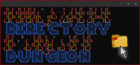
A tiny dungeon crawler played right in the windows file explorer. Explore a loot-filled dungeon by dragging and dropping your player folder into new rooms, equip powerful files, defeat terrible monsters, and banish evil once and for all.

$1.99Positive(23)
Text-BasedAbstractDungeon Crawler
JuhrJuhrMar 9, 2026

Directory Dungeon - File Explorer Dungeon Crawler scores 63/100 — better than 12% of Text-Based capsules (n=727).

Positive (23 reviews) · $1.99 · Released Mar 9, 2026 · By JuhrJuhr

Quick text summary

Directory Dungeon - File Explorer Dungeon Crawler scored 63/100 on Steam Analyzer — Solid for a Text-Based capsule. Top priority fix: [composition] Reduce or simplify the background flame pattern to 3–5 anchor elements instead of the current grid, creating breathing room and stronger focus on the title at small sizes.

Capsule scores by dimension

  • Genre Clarity: 7/10 — Retro dungeon crawler with neon aesthetic. The neon blue pixelated text 'DIRECTORY' and 'DUNGEON' immediately signals a retro RPG or dungeon crawler theme, reinforced by the repeated flame/monster icons in orange-red that suggest enemies or hazards. At tiny size, the dual-line neon text layout and flame pattern still convey a fantasy adventure tone, though the 'directory' framing is harder to parse at that scale.
  • Title Readability: 6/10 — Readable at full size, loses clarity at tiny. The title uses a clean neon blue bitmap font that reads clearly at full header size with strong contrast against the dark background. However, at tiny size (120x45), both 'DIRECTORY' and 'DUNGEON' become difficult to distinguish as separate words due to the stacked layout and pixel density, and the tagline becomes completely illegible.
  • Contrast & Color: 7/10 — Strong neon pop with limited palette. The bright neon blue title text pops effectively against the dark background, and the orange-red flame pattern provides warm accent color. The grayscale separation is clear, but the repeated flame pattern fills most of the background, creating visual noise that competes with the title hierarchy at smaller sizes.
  • Uniqueness & Polish: 6/10 — Competent retro style, somewhat generic execution. The neon dungeon crawler aesthetic is on-brand for indie RPGs and the file explorer concept is genuinely unique, but the capsule relies heavily on standard retro bitmap styling without a distinctive visual hook that elevates it beyond 'competent neon title over pattern.' The flame icons are functional but feel like filler rather than a purposeful design element.
  • Brand Consistency: 6/10 — Neon retro identity present but generic. The neon blue palette and pixelated font create a consistent retro identity, and the flame pattern suggests a dungeon theme. However, without seeing the game's UI or store screenshots side-by-side, the identity feels more like a genre convention (retro RPG neon) than a unique brand signature that would be immediately recognizable as 'Directory Dungeon' specifically.
  • Composition: 6/10 — Centered layout with competing visual weight. The title is centered and stacked vertically, occupying prime real estate effectively at full size, with the small folder icon in the lower right providing a secondary focal point that reinforces the file explorer gimmick. At tiny size, the repetitive flame background pattern creates visual clutter that dilutes the focal point, and the two-line title stacking becomes harder to parse as a single entity.

What works

  • Unique file explorer gameplay hook. The small folder icon and 'directory/dungeon' double meaning communicate the core mechanic visually, which is memorable and immediately distinguishes this from generic dungeon crawlers.
  • Strong neon-to-dark contrast. The bright blue and orange colors have excellent value separation against the dark background and maintain readability at full size.
  • Retro genre clarity at full size. The pixelated bitmap font and flame pattern immediately read as dungeon crawler at normal header viewing distance.

What hurts the capsule

  • Background pattern creates visual competition. The repetitive orange flame icons fill the entire background and distract from the title hierarchy, reducing focus at small sizes.
  • Title legibility collapses at tiny size. The stacked two-line layout becomes pixelated and difficult to parse as distinct words when the capsule shrinks to thumbnail view.
  • Generic retro neon execution. While the concept is unique, the visual presentation relies on standard 80s/90s neon clichés without a distinctive artistic signature or memorable identity marker.

Priority fixes

  1. [composition] Reduce or simplify the background flame pattern to 3–5 anchor elements instead of the current grid, creating breathing room and stronger focus on the title at small sizes.
  2. [title_readability] Replace the stacked two-line layout with a single horizontal 'DIRECTORY DUNGEON' line or add thicker stroke outlines to the bitmap font to maintain legibility at 120px width.
  3. [uniqueness_polish] Integrate the folder icon more prominently into the title design (e.g., as a badge or embedded element) to create a more distinctive and memorable brand hook.
  4. [genre_clarity] Add a subtle dungeon environment element (e.g., a small HP bar, treasure, or enemy silhouette) in the lower third to reinforce the RPG mechanic beyond the flame pattern alone.

Store copy priority fixes

  1. [feature_communication] Add a structured feature list below the main description covering: number of dungeon floors/areas, roguelike run structure, permadeath or difficulty modes, estimated playtime per run, and monster variety. Replace or clarify the 'cabbage' reference with a concrete progression/resource mechanic.
  2. [audience_targeting] Insert 1-2 sentences explicitly describing intended player type: e.g., 'Perfect for indie game enthusiasts and retro RPG fans who love creative, offbeat mechanics over polished graphics.' This removes ambiguity about who the game serves.
  3. [feature_communication] Expand on combat and progression systems with one sentence: specify whether combat is purely auto-resolved, menu-driven, or requires input, and clarify how equipment tier/stat scaling works within the file-system metaphor.

Related guides

Steam app ID: 3333010 · Tags: Text-Based, Abstract, Dungeon Crawler, RPG, Roguelike