Scoring genre clarity...

Sheva capsule

Sheva

Sheva is a single-player roguelite card-fighting game where both fighters act simultaneously. Read your opponent, defeat seven chakra bosses, and survive the run to reach the final trial.

$6.992 user reviews
Early AccessCard BattlerTurn-Based Combat
GoldtusksDec 1, 2025

Sheva scores 75/100 — better than 68% of Early Access capsules (n=3,067).

2 user reviews · $6.99 · Released Dec 1, 2025 · By Goldtusks

Quick text summary

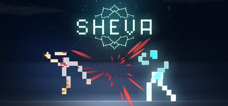
Sheva scored 75/100 on Steam Analyzer — Good for a Early Access capsule. Top priority fix: [genre_clarity] Add a recognizable card or boss silhouette silhouette to the composition to reinforce 'card fighting' identity and improve genre clarity at TINY size, where current pixel clusters may read as generic action collision.

Capsule scores by dimension

  • Genre Clarity: 7/10 — Card game with action combat implied. The pixelated card/block elements (left and right sides) and central energy burst clearly signal a tactical or card-based game mechanic. The geometric abstraction and simultaneous-action visual language read as strategy-focused at full size, though at TINY size the genre becomes less specific—it could read as any action game with the cards becoming unreadable geometric noise.
  • Title Readability: 8/10 — Clear geometric title, holds at small. SHEVA uses a clean, geometric sans-serif with consistent letterforms and good spacing. The cyan/teal color provides solid contrast against the dark space background. At TINY size the title remains identifiable as a word-shaped block, and the geometric crown motif above anchors recognition without competing for attention.
  • Contrast & Color: 8/10 — Strong cyan pop with red accent clarity. The bright cyan title and geometric elements read crisply against the deep blue-black starfield background with excellent value separation. The red energy burst in the center creates a dynamic focal point with warm-cool contrast. In grayscale, the mid-tone differentiation holds well, and the silhouette of the pixel clusters remains distinct even at TINY size.
  • Uniqueness & Polish: 7/10 — Solid indie aesthetic, recognizable style. The pixelated block aesthetic with geometric crown and synchronized energy burst communicate a deliberate art direction that feels intentional and polished. The simultaneous action concept is visually hinted at by the mirrored pixel clusters and central collision point, adding narrative clarity. However, the pixel-art style is familiar in indie games, and without character or unique villain presence, it reads as well-executed but not exceptionally distinctive compared to top-tier indie launches.
  • Brand Consistency: 7/10 — Coherent geometric identity, limited iconic hook. The cyan/teal palette, geometric crown symbol, and pixelated abstraction create internal visual consistency and a recognizable 'tech-spiritual' tone that should carry across other marketing materials. The crown motif is a clear brand anchor that could become iconic. However, without a memorable character, creature, or signature opponent face, the identity feels slightly generic within the roguelite space—strong enough for cohesion but not exceptionally memorable.
  • Composition: 8/10 — Balanced focal point, clear hierarchy. The red energy burst in the center creates a strong primary focal point, with symmetrical pixel clusters on left (warm tones) and right (cool tones) providing balanced secondary interest and visual depth. The SHEVA title sits safely in the upper third with breathing room, and the starfield background provides neutral negative space. At SMALL and TINY sizes the composition collapses cleanly into a recognizable abstract form: center burst with side accents and top logo.

What works

  • Immediate visual metaphor for simultaneous combat. The mirrored pixel clusters converging on a central energy explosion instantly communicates the core mechanic of reading and reacting to an opponent in real time.
  • Strong title and logo presence at all sizes. The geometric SHEVA wordmark and crown anchor the upper composition with excellent contrast and readability that survives down to TINY thumbnails without breaking.
  • Coherent warm-cool color language. The orange-yellow pixels (left) versus cyan-white pixels (right) with a red collision point creates an intuitive visual story of opposing forces and clear spatial depth.

What hurts the capsule

  • Generic pixel-art execution within indie crowding. While well-crafted, the pixelated aesthetic lacks a distinctive character, creature, or villain that would make this capsule stand out in a crowded roguelite/indie strategy shelf.
  • Limited visual storytelling of the chakra boss concept. The capsule emphasizes the simultaneous combat mechanic but does not visually hint at the mystical, chakra-based opponent variety that differentiates this game from other card fighters.
  • Starfield background is functional but safe. The dark space motif is neutral and clean, but it does not reinforce genre, tone, or the card-fighting identity as strongly as a more thematic background could.

Priority fixes

  1. [genre_clarity] Add a recognizable card or boss silhouette silhouette to the composition to reinforce 'card fighting' identity and improve genre clarity at TINY size, where current pixel clusters may read as generic action collision.
  2. [uniqueness_polish] Introduce one iconic chakra boss character or mystical visual element (shadow, aura, sigil) to differentiate from generic simultaneous-action games and signal the roguelite progression loop.
  3. [brand_consistency] Reinforce the crown motif or create a secondary icon that bridges the geometric and chakra themes, making the brand more memorable and cohesive across store assets.

Store copy priority fixes

  1. [feature_communication] Add a sentence explaining how players build or customize their deck (e.g., 'Earn and unlock cards from defeated bosses to shape your fighting style for the next run')
  2. [audience_targeting] Add a sentence signaling difficulty and appeal (e.g., 'Master the read-ahead mind game at your own pace, or face legendary difficulty runs') to help players self-select
  3. [feature_communication] Replace 'Cards do more than deal damage' with a concrete example: 'Play an Armor card to block the next two turns, or a Shatter card to prevent your opponent from charging'
  4. [uniqueness] Add a differentiator callout at the end of the short description or in the detailed opening, such as 'No reaction turns—every decision is a commitment' to emphasize what separates this from turn-based competitors

Related guides

Steam app ID: 3337620 · Tags: Early Access, Card Battler, Turn-Based Combat, Roguelite, Card Game