Scoring genre clarity...

The Last Prisoner capsule

The Last Prisoner

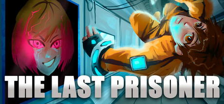
The Last Prisoner - Hardcore Sci-fi platformer. You are the last prisoner awakened from a corrective cryo-sleep, your task is to escape a space prison containing a rebellious AI and find out where everyone else is? The only way to escape is to manipulate gravity and adapt to the chaos around you.

$2.99Positive(16)
Precision PlatformerDifficultOld School
PopCorn BunkerAug 28, 2025

The Last Prisoner scores 72/100 — better than 44% of Precision Platformer capsules (n=784).

Positive (16 reviews) · $2.99 · Released Aug 28, 2025 · By PopCorn Bunker

Quick text summary

The Last Prisoner scored 72/100 on Steam Analyzer — Good for a Precision Platformer capsule. Top priority fix: [genre_clarity] Add a subtle visual cue communicating gravity mechanic—such as floating particles, warped perspective, or inverted UI elements—to distinguish this as a gravity-manipulation platformer at TINY size.

Capsule scores by dimension

  • Genre Clarity: 7/10 — Sci-fi action platformer readable. The capsule communicates sci-fi setting through glowing neon aesthetic, futuristic character suit, and technological environment with visible holograms and industrial architecture. At TINY size, the orange-suited figure and cyan sci-fi color scheme are still recognizable, though the platformer/gravity-manipulation core mechanic is not visually explicit. Genre reads as sci-fi action but lacks specific platformer iconography.
  • Title Readability: 8/10 — Title legible across all sizes. White all-caps sans-serif text "THE LAST PRISONER" is positioned in the lower third with strong contrast against the darker image region below the character. The letterforms remain clear and readable at SMALL (231x87) and TINY (120x45) sizes due to thick weight and clean kerning. No decorative fonts or layered effects compromise legibility at any viewing scale.
  • Contrast & Color: 8/10 — Strong neon pop on dark steam background. Vibrant magenta glow on the left character face and cyan-blue accents on the right suit create excellent value separation against the Steam dark background #1b2838. The warm orange suit and cool neon highlights establish clear silhouette definition that survives the TINY grayscale squint test. Saturation is controlled but punchy, avoiding muddy mid-tones.
  • Uniqueness & Polish: 7/10 — Polished sci-fi aesthetic, competent execution. The capsule demonstrates clean craft with intentional lighting design, neon color grading, and character detail that suggests premium production value. However, the dual-character composition and sci-fi prison theme feel somewhat familiar within the action-adventure genre benchmarks; it lacks a distinctive mechanical hook or narrative hook that screams "gravity manipulation platformer." The visual storytelling communicates tone but not unique selling point.
  • Brand Consistency: 6/10 — Coherent sci-fi identity, generic execution. Internal cohesion is solid—neon color palette, tech suit aesthetic, and industrial environment align well across the composition. However, there are no iconic character motifs, symbol systems, or recognizable signature elements that would allow the brand to be identified later without the title. The design is consistent with generic sci-fi indie game expectations rather than distinctive.
  • Composition: 7/10 — Clear dual focal points, good hierarchy. The left glowing face and right action-pose character create two complementary focal points that guide the eye naturally, with the title anchored below providing balance. At SMALL and TINY sizes, the composition holds together with the two characters still distinguishable; the title placement in safe margins is well-executed. The depth layering (face on left, figure on right, environment behind) works effectively, though the composition is slightly symmetrical and could feel tighter.

What works

  • Strong title contrast and legibility. White sans-serif text maintains perfect readability across full, small, and tiny sizes with no decorative flourishes or outline loss.
  • Vibrant neon color separation. Magenta and cyan accents pop distinctly against the Steam dark background with excellent silhouette clarity in grayscale.
  • Effective dual-character composition. Two focal points (glowing face and action pose) create visual interest and guide attention without cluttering or competing equally.
  • Polished sci-fi production craft. Intentional lighting, detail work, and color grading communicate quality and premium presentation.

What hurts the capsule

  • Generic sci-fi indie visual language. The aesthetic reads as familiar within the genre benchmarks and lacks distinctive art direction or memorable identity cues beyond neon coloring.
  • Mechanic clarity missing from visuals. Gravity manipulation and platformer core mechanics are not visually communicated; a viewer sees sci-fi action but not the unique gameplay hook.
  • No iconic character or motif. The suit and face design are solid but interchangeable with other sci-fi games; there is no signature element that builds brand recall.

Priority fixes

  1. [genre_clarity] Add a subtle visual cue communicating gravity mechanic—such as floating particles, warped perspective, or inverted UI elements—to distinguish this as a gravity-manipulation platformer at TINY size.
  2. [uniqueness_polish] Refine the character design or suit with a distinctive silhouette or color accent that could become iconic and differentiate from generic sci-fi games.
  3. [brand_consistency] Introduce a recurring symbol, pattern, or UI motif (such as a cryo-pod emblem or gravity indicator) visible in multiple store screenshots to reinforce internal brand identity across marketing.

Store copy priority fixes

  1. [hook_strength] Rewrite the short description's opening to lead with a vivid action verb or emotional core: 'Fight gravity itself to escape a vindictive AI and uncover humanity's fate' would replace the generic 'Hardcore Sci-fi platformer' opener.
  2. [uniqueness] Add a sentence after 'gravity changing mechanics' explaining the specific advantage or scope: e.g., 'Flip gravity mid-jump to solve deadly puzzles, or reverse it to dodge AI traps in real-time'—this shows why the mechanic is special.
  3. [feature_communication] Expand the story and character section with at least one concrete plot beat or character detail: 'Discover why the AI rebelled and what happened to the other prisoners' would replace the vaguer 'uncover the truth about humanity's fate'.

Related guides

Steam app ID: 3341150 · Tags: Precision Platformer, Difficult, Old School, 2D Platformer, Side Scroller